
Art quilters, please help: how can I fix this quilts?

 06-24-2013, 05:47 PM
#12
Banned
Join Date: Mar 2010
Location: Sturbridge, Ma
Posts: 3,992
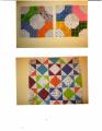
I would extend the small flowers more in the lower right. Thee lower right looks a bit unbalanced. Just a few to fill some of the bank space. This is how I would comment if the piece was being judged. I believe this would give it more overall balance.
 06-24-2013, 06:18 PM
#16
Super Member
Thread Starter
Join Date: Jul 2010
Location: SW Florida
Posts: 1,199
I had plans to do a binding with a dark batic (which is the backing). Hadn't thought about another border, tho. I'll play with that and see how it feels.
DogHouseMom also suggested other kinds of embellishments -- I think I"ll play around with that idea too.
Thanks, all!
DogHouseMom also suggested other kinds of embellishments -- I think I"ll play around with that idea too.
Thanks, all!
07-14-2013, 07:15 AM
#17
Super Member
Thread Starter
Join Date: Jul 2010
Location: SW Florida
Posts: 1,199
HI all, if you want to see how this ended up, I posted it in the pictures area: http://www.quiltingboard.com/picture...ml#post6176801
Thanks for all your suggestions!
Thanks for all your suggestions!
07-14-2013, 10:24 AM
#18
Super Member

Join Date: May 2010
Location: New Hampshire
Posts: 3,699
All I can say is WOW!. I noticed the quilting stood out more in the upper left hand corner than it did in the lower right hand corner. Maybe that's what is tugging at you. Both have not applique, which I think is nice, so I wouldn't applique anything in the blue corner, although that was my first though. Perhaps a quilting patter that is tighter and in a more contrasting thread that what you have used? The thread and quilting really stand out in the upper left. Perhaps that could be echoed in the lower right. You have done a marvelous job!

Thread
Thread Starter
Forum
Replies
Last Post
Izy
Main
8
04-25-2008 08:01 AM
