
Color advice?


 02-23-2013, 09:15 PM
#13
Super Member
Join Date: Aug 2010
Location: Piedmont Virginia in the Foothills of the Blue Ridge Mtns.
Posts: 8,562
I think your issue with these fabrics is the lack of value difference. If you add some much darker values -- there's a great darker green in those prints, for instance -- it will jack all of them up a bit. Also something in the warm family as mentioned.
Jan in VA
Jan in VA
 02-23-2013, 09:51 PM
#15
Junior Member
Join Date: Nov 2012
Location: Central Jersey
Posts: 145
I like what you have so far, the only thing I think I would add is a red. Also a neat little trick to see if colors go together is to look at the colored dots that you find in the salvage end of the fabric. If you find colors the match or as close as possible than the colors will work in the quilt.
Rosie
Rosie
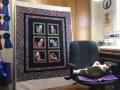
I'm about to embark on this dinosaur quilt for my three-year-old, but I'm having some trouble choosing colors. I got three prints from a line of dinosaur fabric but to me they don't really look like they belong together. I got some greens to go along with them and then I shopped my stash for some blues, but I'm still not sure.
I know it's tough to tell exactly what colors actually look like from a photo, but I think you can at least get an idea about how they compare to each other? Anyway here's what I've lined up. Any advice? Any fabrics you would take out of the line up or any colors you might try to add?
Thank you!!
I know it's tough to tell exactly what colors actually look like from a photo, but I think you can at least get an idea about how they compare to each other? Anyway here's what I've lined up. Any advice? Any fabrics you would take out of the line up or any colors you might try to add?
Thank you!!
02-24-2013, 04:14 AM
#16
Super Member
Join Date: Dec 2010
Location: New York City/Manhattan
Posts: 1,316
I agree with those who spoke about a warm color. I am not crazy about your yellow-greens. I think for a child, they need to be more in line with the true green in the dino print. I would add the brick red color (almost like the color you chose for the background of the photos). I would also agree with those who think the blues are too grey. Again, you want more "true" colors to match the intensity of the colors in the blue dino print. This dino print is really adorable.
02-25-2013, 12:40 PM
#17
Junior Member
Thread Starter
Join Date: Mar 2009
Location: Rough and Ready, CA
Posts: 144
Thank you so much everyone for your advice and suggestions. I got some warmer colors (an orange, a yellow and an orange-ish kind of brown). I didn't get a red though because (it's hard to tell from the photo) the dinosaur that looks red is really more of a pink. I didn't think my son would really go for pink, though he does actually kind of like purple, haha. I added a couple of other blues to the mix, too, because I think I will do one set of blocks in green, one in the warmer colors and the other set in the blues.
Anyway here's the new palette. There is one color that is a lighter blue green that doesn't really seem to go when you look at the photo, but it matches one of the dinosaurs almost exactly and it has flecks of that darker blue that is in the blue dinosaur print, too, so I think it will work.
Thanks again for the help! Choosing color is not really my strong point, so I need all the help I can get.

Thread
Thread Starter
Forum
Replies
Last Post
