Go Back  Quiltingboard Forums > Main
Flashback to '80's? >

Flashback to '80's?

Flashback to '80's?

Thread Tools
 
Old 02-05-2016, 06:02 PM
  #11  
Super Member
 
mom-6's Avatar
 
Join Date: Feb 2010
Location: Texas
Posts: 6,395
Default

Since you're using a variety of fabrics, I'd use the lighter side when you need greater contrast with a slightly lighter 'dark' and go with the front side for the really dark ones.
mom-6 is offline  
Old 02-05-2016, 06:24 PM
  #12  
Super Member
 
mike'sgirl's Avatar
 
Join Date: May 2012
Location: starke,Florida
Posts: 2,025
Default

Originally Posted by Tartan View Post
I cut 5 dark 2X5 inch rectangles and 5 light 2X5 inch rectangles. I lay the light wrong side down on the dark in a upside down L shape like you join binding, draw the 45* line, stitch on the line, check to make sure it is a perfect join and then trim away the corner triangle to the 1/4 inch seam.
I thought the stripes would bother me but B is growing on me.

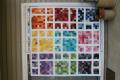
I like the B side better too. I like the idea of using the backside only when you need a sharper contrast.

Last edited by mike'sgirl; 02-05-2016 at 06:37 PM.
mike'sgirl is offline  
Old 02-05-2016, 06:54 PM
  #13  
Super Member
 
Join Date: Oct 2013
Location: Tulsa, Ok
Posts: 4,582
Default

I vote for the left (wrong side up) just because of the greater contrast. But the difference is subtle and either one works nicely!
Jeanne S is offline  
Old 02-05-2016, 07:08 PM
  #14  
Super Member
 
Join Date: Mar 2010
Location: greater NorthEast
Posts: 3,004
Default

definitely the wrong side is less noticeable/more subtle
just_the_scraps_m'am is offline  
Old 02-05-2016, 07:08 PM
  #15  
Super Member
 
Join Date: Nov 2010
Location: Mabank, Texas
Posts: 8,780
Default

I like the right side best. Love the design you are using.
BETTY62 is offline  
Old 02-06-2016, 03:15 AM
  #16  
Super Member
 
Join Date: Mar 2012
Location: Thornton, Colorado
Posts: 1,023
Default

The right side looks appealing because the color is more compatible as a contrast. The wrong side is kinda dull, and it seems to drag the project down. Love the pattern!
quilttiger is offline  
Old 02-06-2016, 03:34 AM
  #17  
Super Member
 
jmoore's Avatar
 
Join Date: Feb 2011
Location: Boothbay Maine
Posts: 9,518
Default

I like B better too... the colors play nicely with the others. Funny, the fabric looks great in your block but in the pieces of scrap you first photographed, it reminds you of wallpaper from the 80's LOL
jmoore is offline  
Old 02-06-2016, 05:37 AM
  #18  
Super Member
 
southernmema's Avatar
 
Join Date: Feb 2011
Location: Central Georgia
Posts: 1,305
Default

I vote right side.
southernmema is offline  
Old 02-06-2016, 06:05 AM
  #19  
Super Member
 
WMUTeach's Avatar
 
Join Date: Dec 2010
Location: Portage, Michigan
Posts: 7,406
Default

I inherited my sister-in-laws stash and I found some of this fabric. Some of you board members have it now. I included in in my 2.5 square swap, Sweet Treats birthday swap. Enjoy it everyone! From my stash to yours!
WMUTeach is offline  
Old 02-06-2016, 06:07 AM
  #20  
Super Member
 
WMUTeach's Avatar
 
Join Date: Dec 2010
Location: Portage, Michigan
Posts: 7,406
Default

I vote B. I don't care for the "fuzzy" look of the print reversed. My opinion only!
WMUTeach is offline  

Posting Rules
You may not post new threads
You may not post replies
You may not post attachments
You may not edit your posts

BB code is On
Smilies are On
[IMG] code is On
HTML code is On
Trackbacks are Off
Pingbacks are Off
Refbacks are Off


FREE Quilting Newsletter