
Which would you choose?

 01-22-2013, 12:30 PM
#92
Junior Member
Join Date: Nov 2011
Location: Sebastopol, California
Posts: 147
Originally Posted by Sunnie

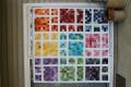
I am working on the Tradewinds pattern and can't decide which batik to use as the "background". I think I like them both, but don't want to start cutting till I'm sure. Which would you choose?[ATTACH=CONFIG]389831[/ATTACH][ATTACH=CONFIG]389832[/ATTACH]


Thread
Thread Starter
Forum
Replies
Last Post
