
Help with color placement choices
 06-28-2011, 11:15 AM
#1
Member
Thread Starter

Join Date: May 2011
Location: Texas
Posts: 80
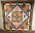
I came back from the LQS with more lovely fat quarters. With a D9P already set in my head i started cutting my squares. I seem to be tearing myself into two sides that cant come to an agreement. so maybe some extra eyes can help me.
I liked the gray fabric with those vines but i think the b&w squares look better as the main squares with the black ones. maybe
So i think i like option 2 but i liked showcasing that gray in option 1. but i think option 2 flows better.... LOL see my perdicament?
Extra professional eyes like yall would help from a different view! Whats your opinions?
option 1
[ATTACH=CONFIG]218118[/ATTACH]
option 2
[ATTACH=CONFIG]218119[/ATTACH]


 06-28-2011, 11:56 AM
#7
Super Member
Join Date: Jun 2008
Location: Utah
Posts: 8,845
Originally Posted by Kas
I like #1. The black print in the smaller amount gives more movement and interest to the blocks. It is just too overpowering in the larger size. Nice colors!
06-28-2011, 11:57 AM
#8
Super Member

Join Date: Mar 2007
Location: Adelanto, CA
Posts: 4,044
I think #1 but agree it is difficult to choose ... maybe if you had all the blocks on a design wall, take a photo, walk away and look at it again. kinda hard to tell with only a handful of blocks
But it will turn out wonderful ... D9P is one of my faves, and any quilt in b/w/r gets my approval.
But it will turn out wonderful ... D9P is one of my faves, and any quilt in b/w/r gets my approval.
 06-28-2011, 12:00 PM
#10
Senior Member

Join Date: Jan 2011
Location: PA
Posts: 305
I like them both as well.
Option 1 overall in the finished quilt would give a softer calmer look with Option 2 having a little more active kind of look.
Guess it would depend on the outcome look you want. Either way looks great and would work just fine.
Option 1 overall in the finished quilt would give a softer calmer look with Option 2 having a little more active kind of look.
Guess it would depend on the outcome look you want. Either way looks great and would work just fine.

Thread
Thread Starter
Forum
Replies
Last Post
AngelinaMaria
Main
8
10-31-2011 06:42 AM
