Go Back  Quiltingboard Forums >
  • Pictures
  • Opinions please!! this just doesn't look right to me!! >
  • Opinions please!! this just doesn't look right to me!!

  • Opinions please!! this just doesn't look right to me!!

    Old 03-29-2013, 03:24 PM
      #11  
    Super Member
     
    Join Date: Aug 2010
    Location: Roswell, NM
    Posts: 1,727
    Default

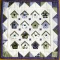
    Maybe what seems off to you is that the print in the block has a lot of white and your border fabric doesn't have any white. I would audition a narrow white border followed by the floral border and see if that works better. I really like the drunkard's path you have and also like the border but tend to agree that while it looks good it may not be perfect. A lot of good suggestions have been made so you have options to experiment with. Your piecing and curves are perfect, drunkard's path is one of my favorite patterns because there are so many ways to lay it out. Keep us posted as to how you finish up.
    greensleeves is offline  
    Old 03-29-2013, 04:09 PM
      #12  
    Power Poster
     
    QuiltnNan's Avatar
     
    Join Date: Mar 2011
    Location: western NY formerly MN, FL, NC, SC
    Posts: 51,430
    Default

    i like it the way it is
    QuiltnNan is offline  
    Old 03-29-2013, 04:39 PM
      #13  
    Super Member
     
    Join Date: Jan 2011
    Location: SE Iowa
    Posts: 1,583
    Default

    Maybe a thin (1-2"?)border between the main section and the wider burgundy floral?
    I'd chose a white or black.
    joyce blint is offline  
    Old 03-29-2013, 04:44 PM
      #14  
    Super Member
     
    Christine-'s Avatar
     
    Join Date: Jan 2012
    Location: USA
    Posts: 1,623
    Default

    Originally Posted by joyce blint
    Maybe a thin (1-2"?)border between the main section and the wider burgundy floral?
    I'd chose a white or black.
    yes, Joyce has it right on...it needs a small white border between the main section and the border.
    Christine- is online now  
    Old 03-29-2013, 04:45 PM
      #15  
    Super Member
     
    Just Jan's Avatar
     
    Join Date: Jun 2010
    Location: Florida
    Posts: 1,580
    Default

    Originally Posted by Sarah in Brooklyn
    I don't love the geometric/modern look of the quilt and the more traditional, floral border. I think a border in the maroon solid would be perfect, or maybe a slightly darker complimentary color - a dark neutral grey?. The quilt is gorgeous!!
    I totally agree... The color is fine but the contemporary design in the quilt does not go with the floral design in the border print. Perhaps a stripe or even a plaid in the same colors might work. The quilt is beautiful... I just don't like the flowers with it. Do you have enough of the solid fabric in the quilt to make even a small first border to frame it? I'd like a solid maroon small border then some contemporary print for the outside border. Do you have enough scraps to make some sort of pieced border for the second border? But as I said earlier, I love the quilt and you did a great job on it.
    Just Jan is offline  
    Old 03-29-2013, 04:50 PM
      #16  
    Super Member
     
    Delta's Avatar
     
    Join Date: Jul 2011
    Location: Waco Texas
    Posts: 1,182
    Default

    The only thing i see is you might need a thin border between the drunkard path and the border. there is nothing to stop the pattern between the two. If you have a color darker than the drunkard path that might wk maybe 1 to 1.5inch piece. Hope that helps
    Delta is offline  
    Old 03-29-2013, 04:56 PM
      #17  
    Senior Member
     
    Join Date: Nov 2011
    Location: Carolina
    Posts: 877
    Default

    Well, that is the perfect fabric for drunkard's path - my eyes think they are drunk already!
    Material Witness is offline  
    Old 03-29-2013, 04:58 PM
      #18  
    Junior Member
     
    kubby343434's Avatar
     
    Join Date: Jan 2013
    Posts: 137
    Default

    luv it, itlooks awesome
    kubby343434 is offline  
    Old 03-29-2013, 05:48 PM
      #19  
    Super Member
     
    Join Date: Apr 2010
    Location: Centerville, WA
    Posts: 1,254
    Default

    First off, it is a beautiful quilt. You done a fantastic job on it. IMO I think it would stand out more if you put a 2" border of the solid burgundy between the quilt & the flowered border just to frame it in. I think it would make the pattern pop more.
    Halo is offline  
    Old 03-29-2013, 05:56 PM
      #20  
    Super Member
     
    Join Date: May 2010
    Location: Washington state
    Posts: 4,303
    Default

    I wouold just lay a couple of other options over that border and see if I found anything I liked better. Good luck!
    Lilrain is offline  
    Related Topics
    Thread
    Thread Starter
    Forum
    Replies
    Last Post
    Moira in N.E. England
    Main
    32
    10-30-2018 04:28 PM
    seaside quilter
    Main
    31
    01-29-2015 04:54 PM
    nygal
    For Vintage & Antique Machine Enthusiasts
    4
    10-27-2012 07:06 AM
    juniemoon
    Pictures
    110
    03-01-2011 02:31 AM
    butterflywing
    General Chit-Chat (non-quilting talk)
    43
    07-15-2010 12:58 PM

    Posting Rules
    You may not post new threads
    You may not post replies
    You may not post attachments
    You may not edit your posts

    BB code is On
    Smilies are On
    [IMG] code is On
    HTML code is On
    Trackbacks are Off
    Pingbacks are Off
    Refbacks are Off


    FREE Quilting Newsletter