Go Back  Quiltingboard Forums >
  • Main
  • which one looks the best? >
  • which one looks the best?

  • which one looks the best?

    Old 09-04-2017, 02:21 PM
      #11  
    Power Poster
     
    Join Date: Mar 2009
    Posts: 15,639
    Default

    They both work but the one with the pop of hot pink sings. It could use a few more.
    MadQuilter is offline  
    Old 09-04-2017, 02:22 PM
      #12  
    Super Member
     
    Join Date: Oct 2009
    Location: South Carolina
    Posts: 3,155
    Default

    Extra pop of color is nice. My pick.
    sewgull is offline  
    Old 09-04-2017, 02:23 PM
      #13  
    Super Member
     
    Battle Axe's Avatar
     
    Join Date: Apr 2010
    Location: Northeastern Indiana
    Posts: 2,800
    Default

    I love bold color, the one with the bright pinks. Marcia
    Battle Axe is offline  
    Old 09-04-2017, 03:47 PM
      #14  
    Senior Member
     
    Join Date: Apr 2017
    Location: Gilbert, AZ
    Posts: 985
    Default

    I like the brights. It's also helpful to take a full shot picture and look at it on the computer. Helps me see anything that stands out or needs to be moved.
    Faintly Artistic is offline  
    Old 09-04-2017, 05:12 PM
      #15  
    Junior Member
     
    mmac71's Avatar
     
    Join Date: Aug 2012
    Location: Middle of Oklahoma
    Posts: 272
    Default

    Originally Posted by Kitsie
    I like the "pop" of the bright pink bits! Nice use of fabrics.
    Hey, I'm a 1941 also!
    I m another 1941!
    mmac71 is offline  
    Old 09-04-2017, 05:23 PM
      #16  
    Super Member
    Thread Starter
     
    quiltlady1941's Avatar
     
    Join Date: Jun 2010
    Location: Illinios
    Posts: 1,260
    Default

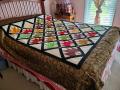
    Thanks Ladies, I too was leaning more to the brighter pink squares here and there, and yes I think a few more would be better also, I'll dig into my scarps and see if I can find some more bright one..Thank you everyone, I can always count on everyone on this forum to help out anytime.. Thank you!
    quiltlady1941 is offline  
    Old 09-05-2017, 12:39 PM
      #17  
    Power Poster
     
    Jingle's Avatar
     
    Join Date: Dec 2009
    Location: Outside St. Louis
    Posts: 38,213
    Default

    I like 1st picture.
    Jingle is offline  
    Old 09-05-2017, 10:13 PM
      #18  
    Junior Member
     
    Vicki1212's Avatar
     
    Join Date: Jul 2014
    Location: Kwazulu Natal, South Africa
    Posts: 265
    Default

    My favourite is the one with the bright pink blocks. It gives the eyes something to settle on and adds a pop to the quilt. Very pretty!
    Vicki1212 is offline  
    Old 09-05-2017, 10:41 PM
      #19  
    Super Member
     
    Join Date: Aug 2013
    Location: Arizona
    Posts: 2,355
    Default

    Originally Posted by Quilt30
    Stand away from it and squint your eyes. Then decide. I personally prefer without the bright pink.
    Ditto for me.
    Tiggersmom is offline  
    Old 09-06-2017, 02:18 AM
      #20  
    Senior Member
     
    Reba'squilts's Avatar
     
    Join Date: Nov 2011
    Location: South East Michigan...at the bottom of the thumb!
    Posts: 730
    Default

    I agree with bkay, more bright pinks or without. I think I like the without best, looks vintage!
    Reba'squilts is offline  
    Related Topics
    Thread
    Thread Starter
    Forum
    Replies
    Last Post
    patti p
    Main
    46
    03-19-2016 03:19 PM
    Teddybear Lady
    Pictures
    220
    10-23-2011 04:45 PM
    Dayken
    Pictures
    220
    10-13-2011 02:09 PM
    moreland
    Pictures
    158
    02-14-2011 09:33 PM
    Hockeyrabbit
    Main
    8
    07-14-2010 11:13 AM

    Posting Rules
    You may not post new threads
    You may not post replies
    You may not post attachments
    You may not edit your posts

    BB code is On
    Smilies are On
    [IMG] code is On
    HTML code is On
    Trackbacks are Off
    Pingbacks are Off
    Refbacks are Off


    FREE Quilting Newsletter