
need some advice on background fabric and sashing option
 12-22-2014, 09:25 AM
#11
Power Poster

Join Date: Mar 2011
Location: western NY formerly MN, FL, NC, SC
Posts: 51,433
Originally Posted by MadQuilter

Your son will love it, no matter what choice you make. I like your layout best of all three - it is "organic".
I see two areas toward the bottom that have large blank areas compared to the rest of the layout that is filled evenly. Can you add a family picture or two to make it even more personal for him? As for the fabrics: I like both reds - they play nicely together. If you use the patterned one, the blocks will appear more subtle. If you use the solid, the blocks will pop more.
I see a small stripe of an ochre-yellow under the black block in the upper center. I really like that with the reds. That color is repeated throughout some of the blocks and it would go good as a frame.
Hope that helps.
 12-22-2014, 11:15 AM
#13
Super Member
Join Date: Aug 2010
Location: North Central, NC
Posts: 2,741
First of all, I too love the solid red and your setting of the blocks is really wonderful. I am sure you will be tweaking that as you go but over all, I like the looks of it and the blocks stand out nicely. Looks like your son got a scholarship since his "other ride is a scholarship". Was it for Harvard?
Secondly, the term "organic synthesis chemist" seems to contain words that are at odds with each other. What does he actually do? Hope you get to visit him in CA.
Secondly, the term "organic synthesis chemist" seems to contain words that are at odds with each other. What does he actually do? Hope you get to visit him in CA.
12-22-2014, 12:13 PM
#14
Member
Thread Starter

Join Date: Apr 2011
Location: Orlando,Fl
Posts: 78
Originally Posted by KLO
First of all, I too love the solid red and your setting of the blocks is really wonderful. I am sure you will be tweaking that as you go but over all, I like the looks of it and the blocks stand out nicely. Looks like your son got a scholarship since his "other ride is a scholarship". Was it for Harvard?
Secondly, the term "organic synthesis chemist" seems to contain words that are at odds with each other. What does he actually do? Hope you get to visit him in CA.
Secondly, the term "organic synthesis chemist" seems to contain words that are at odds with each other. What does he actually do? Hope you get to visit him in CA.
Thanks for the input.
 My son won some scholarships (AXA, Coca-Cola, Intel STS) during his high school year. These scholarships are different from what he got from Harvard, which is financial needed based (not merit based). The t-shirt was an old one from his high school period that has nothing to do with Harvard financial Aid.
 I should make his professional more clear. He synthesis organic molecules for drug discovery use - pharma industry.
I visited his place during Thanksgiving and it was nice to be away from ND.
Thanks for the message. Happy holiday!
12-23-2014, 06:12 AM
#16
Junior Member
Join Date: Dec 2014
Posts: 187
I like the bottom red best..u could just space the center line a little farther apart..wouldn't have to add more..by moving them all a little down..the space would be fill in..in my opinion the top red is too busy with all the rest u have going on..it pulls away from the pictures and etc..if u do a border..I would stick to small print..or u could use the top red for the border.
12-23-2014, 06:34 AM
#17
Super Member

Join Date: Sep 2014
Location: Rural Oklahoma
Posts: 5,374
I like the picture album layout w/ the solid background /sashing the best. You could accentuate that idea by putting a narrow border around each block (maybe ocre yellow ) and a corner triangle in black in each corner like the old scrap album corners
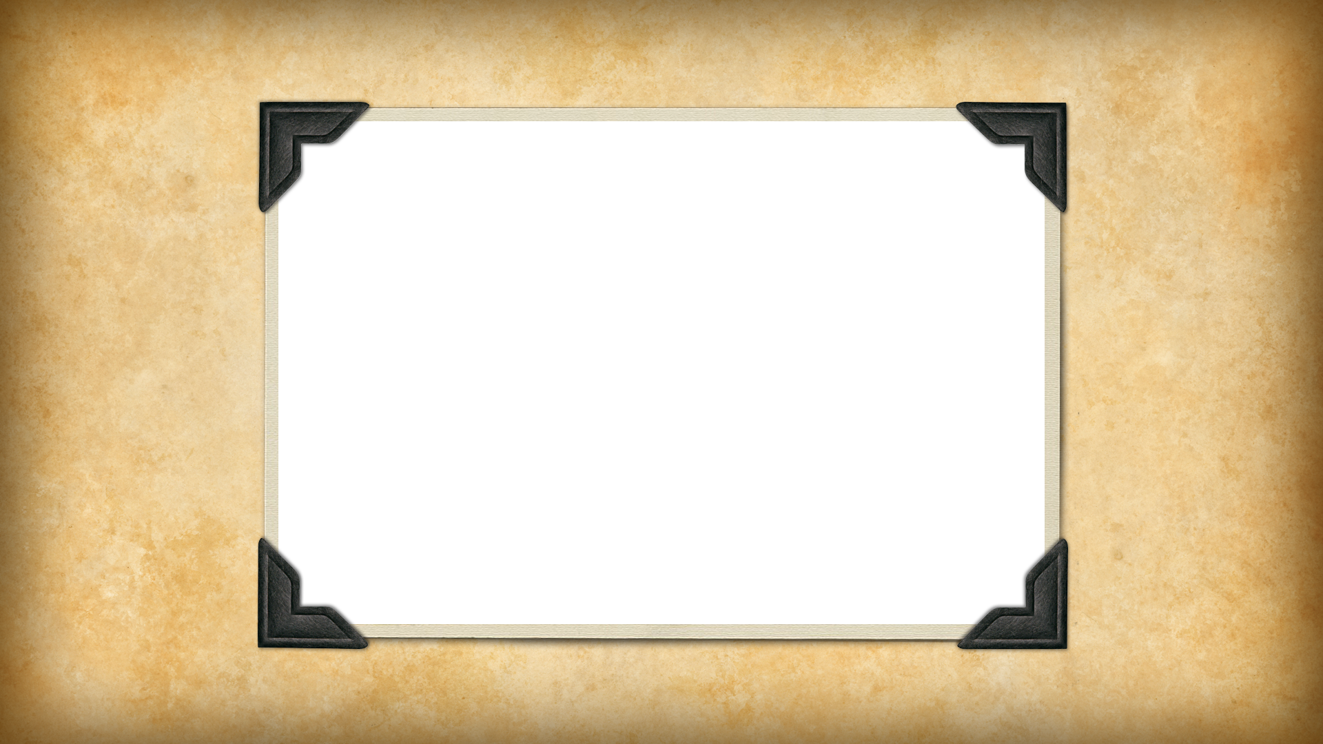
Like these.
Like these.
 12-23-2014, 10:14 AM
#19
Super Member
Join Date: Dec 2012
Posts: 1,857
I really like the first pic. Being a scientist (therefore having a science brain!), I think your son will like the clean format of the first one. The only change I would make would be to move the lowest white patch over a bit towards the middle. This would appear more balanced and it would provide a great spot for you to put a small label.
Your T-Shirt quilt is wonderful (balanced color and pix) and that is was your first quilt is amazing!
Your T-Shirt quilt is wonderful (balanced color and pix) and that is was your first quilt is amazing!

Thread
Thread Starter
Forum
Replies
Last Post
