Not Quite What I Pictured
 02-15-2021, 03:39 AM
#21
Super Member
Join Date: Nov 2008
Location: Seacoast New Hampshire
Posts: 1,177
I think you should go with your original idea and finish the quilt. I have gone thru this with various projects and found that most of the time the finished version looks much better than I thought it would. If you still think the plain triangles need a little something, just do a little hand-stitching in some of the blocks. Maybe outlines of campers or names of states or beaches you've camped at, kind of a memory quilt. When you go someplace new, add that name.
Last edited by Butterfli19; 02-15-2021 at 03:41 AM. Reason: grammar...
 03-03-2021, 06:44 AM
#22
Member
Thread Starter
Join Date: Jan 2021
Posts: 6
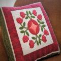
Update. I finally finished the quilt top. It's not exactly what I had pictured, but I think it turned out better than I thought. In hindsight I should have used a darker background fabric so that the pattern would be more prominent. It's a bit big for my RV but I can use it at home.
I won't be quilting this one, it's off to the quilters!
I won't be quilting this one, it's off to the quilters!
Last edited by KarenShu58; 03-03-2021 at 06:46 AM.
03-03-2021, 08:36 AM
#23
Super Member

Join Date: Jun 2010
Location: Waterford Michigan
Posts: 7,241
I was thinking how the blocks would pop with either a very dark brown on dark blue sashing. Your blocks are beautiful. I hope once you decide on a sashing you won't be so disappointed any longer. They just need something that will bring their beauty forward as the focus of the quilt. I would love to see it when you are finished.
03-03-2021, 11:59 AM
#25
Power Poster
Join Date: Feb 2009
Location: Northern Michigan
Posts: 12,861
Often when we reach that point, it�s not what we were envisioning- it will look totally different once it�s all together, quilted and bound- and I bet you will love it again.
you could play around with turning the squares in different ways- to see if you like a different layout better- but you will be surprised how different it looks once the quilting is done
you could play around with turning the squares in different ways- to see if you like a different layout better- but you will be surprised how different it looks once the quilting is done
03-03-2021, 09:53 PM
#26
Super Member
Join Date: Jun 2010
Location: The Deep South near Cajun Country, USA
Posts: 5,383
I agree with Peckish and ckcowl. Once you get this quilted you will be amazed at how much better it will look. I never like my quilts when I get to this point. In face, I dislike them immensely. Then, after the quilting something magical happens. They go from an ugly duckling to a beautiful swan.
03-04-2021, 03:24 AM
#27
Super Member
Join Date: Dec 2010
Location: Portage, Michigan
Posts: 7,359
My thought was the dark blocks are distracting. I like the idea of either gathering them together or spreading them on a diagonal but what I like best was the suggestion of using a dark as the sashing to sort of connect the light, neutral and the dark together. Aren't we all full of opinions and don't quilts have just so many options! Do what makes you feel comfortable and enjoy your finish no matter what you choose in the end. We will be watching.
03-05-2021, 02:13 PM
#28
Senior Member
Join Date: Nov 2008
Posts: 417
I think the blocks are lovely and your workmanship fine...but I am guessing that what is bothering you is that many of the fabrics are very similar in pattern and "value", so they all look the same and you don't feel as engaged with the quilt.
To create interest and draw the viewer in, a composition has to have contrast to it. In the classic and very simple red & white quilts, the contrast is simply the contrast between the red and white, which is very strong. So strong that no matter what the block is, the quilt is arresting.
To add contrast, you can:
-change the colour range...experiment with opposites on the colour wheel ie. you have all blues here, how about a punch of orange (which is the colour across the colour wheel from blues)
-change the values...you are using cream/white triangle centres, mix up the intensity of the blue batiks, attempting to use very light, very dark, and something in between
-change the blocks...mix your very angular triangle blocks with blocks with curved elements...or work in solid blocks (no pattern/piecing)
-change the scale...make a mix of sizes of your chosen block...some very small and one really large!
If you search "triangle quilts" on pinterest you can have a look at how other quilters added interest to a simple block pattern.