
What's wrong with this quilt?
 11-19-2015, 08:30 PM
#1
Member
Thread Starter

Join Date: Mar 2011
Location: Oklahoma
Posts: 55
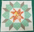
I made this quilt because I wanted to do the Warm Wishes pattern. I also wanted to do the 4 patch posy blocks. Ever since I finished this quilt, I have not liked it. Did I choose the wrong solid colors? The whole color scheme looks bad to me. I am not wanting any compliments. I just want some honest critiques about what is wrong with this quilt. It is perfectly usable, so I will probably donate it to a local women's shelter.


 11-19-2015, 08:52 PM
#5
Super Member
Join Date: Nov 2010
Location: SoCal
Posts: 1,813
It is a nice quilt! Sometimes I hate the fabric or color choices after I finish a quilt, too. At least you tried the patterns you wanted to try. And you can see from the comments, others like it. Just chalk it up to another experience, gift it and quilt on!
Last edited by yngldy; 11-19-2015 at 08:56 PM.
 11-19-2015, 09:03 PM
#8
Senior Member
Join Date: Jan 2011
Posts: 471
As you see from the comments, everyone has different taste and eye for color. It is a nice quilt but for me, I think I would like it better if there were an accent color. I don't know but maybe a little black or a very light color. The colors blend together a bit too much for me. But as I said, it works beautifully for some. Not a waste, I'm glad to hear that you have a place to go with it. Have fun with your next quilt.
11-19-2015, 09:03 PM
#9
Super Member

Join Date: Sep 2014
Location: Rural Oklahoma
Posts: 5,374
Honestly I don't see anything wrong w/ the quilt. It is very expected, the colors perfectly matched to the print. I think it is the perfect quilt for someone who buys the "whole bedroom set" maybe you like to mix and match "your bedroom set" instead.
11-19-2015, 09:08 PM
#10
Power Poster
Join Date: Dec 2008
Location: Western Wisconsin
Posts: 12,930
I think the quilt is lovely. However, I can see why it would not appeal to everyone's taste.
A color scheme of red and green really speaks Christmas. If you had chosen a gold fabric instead of the light yellow, I think the Christmas theme would have carried through. As is, it's not definitely a Christmas quilt so it has a bit of an identity issue. The strongly patterned red fabric pretty much takes over the quilt what with large pieces of it framed, smaller blocks of it in the sashings, plus a wide border. Combined with the solid red, this puts a *lot* of red in the quilt -- which some people find cheerful, and others find unsettling. (Sounds like you are one of the latter!)
I also think that this quilt is a little matchy-matchy in that all of the solid colors appear to be perfect matches to the colors found in the print. Every color in the print is represented exactly by one of the solids; there are no "extra" colors in the quilt, no variations of the colors, etc. This, along with the layout (nothing on-point), makes for a relatively static quilt. The eye, as it roams across the quilt, simply comes across the patterned fabric again and again.
But, frankly speaking, lots of people would be thrilled with this quilt even if it didn't turn out as you envisioned. Most of my quilts are like that.

Thread
Thread Starter
Forum
Replies
Last Post
