
Colors Colors so many Colors
 06-18-2018, 01:13 PM
#1
Senior Member
Thread Starter
Join Date: Mar 2018
Location: Carrollton, TX
Posts: 470
It's time to paint my sewing room again, but I'm stumped as to which color to paint it. I had a nice sage green for a few years and really like it, but now I have that color in the hallway and den so it's out. The latest color was sort of a dusty pink which looked nice enough however, the pink did seem to show up on some of my lighter fabrics, making me thing I must have been totally in luv with pink at one time. My neighbor finally told me it was the paint that was making everything take on a pink cast.
So my question is other than white, which is a bit sterile looking to me, what color do you think is best for a sewing room. The floor is a LVP in a medium dark tone with white woodwork. I only have one window in the room so I can't go to dark on the paint. Pictures of your recommendations would be great and if you can please include paint brand and color number. Thanks in advance for the feedback.
So my question is other than white, which is a bit sterile looking to me, what color do you think is best for a sewing room. The floor is a LVP in a medium dark tone with white woodwork. I only have one window in the room so I can't go to dark on the paint. Pictures of your recommendations would be great and if you can please include paint brand and color number. Thanks in advance for the feedback.


 06-18-2018, 05:05 PM
#5
Super Member
Join Date: May 2017
Location: Sunny Florida
Posts: 4,421
There is so much more that goes into paint color selection. It's a process for sure and there can be lots of misses. What direction does the window face? You will have different lighting at different times of day. Is the flooring cool or warm in tone? What is your color tolerance? Are there any window treatments to consider? What type/kind of lighting is in the room? Do you want neutral or colors?
I suggest a visit to the paint store with a sample of the flooring and or window treatments. Ask for a fan deck. Look at the origin of the color swatch usually at the bottom.
Take numerous swatches that interest you. When you find two or three get samples made. Paint two coats on foam boards. Different colors on each board. Don't paint on current wall color as it doesn't reflect the true color.
Best wishes on color selection. I am trying to decide a new color too.
PS: Did you like the new flooring?
06-18-2018, 06:22 PM
#6
Senior Member
Thread Starter
Join Date: Mar 2018
Location: Carrollton, TX
Posts: 470
Rhonda K, thanks for all the great advice, I will visit our local paint dealer and take a sample of the flooring but as for window treatment I really don't have any. I have a small cornice board at the top of the window, because I wanted to let as much natural light in as possible. I will change the fabric covering on the cornice to compliment the wall color once I have selected one. Selecting paint color is my weakest point. I see a shade in the paint store and think it is perfect but when I get it on the wall it always looks different.
I do love the new flooring. It has a lot of variances and just enough texture to avoid being to slick. The light plays beautifully on it. I can highly recommend Coretec Plus 5 Gold Coast Acacia.
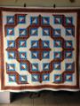
Oh and Wesing, your quilt is very pretty and your little model is even prettier.
I do love the new flooring. It has a lot of variances and just enough texture to avoid being to slick. The light plays beautifully on it. I can highly recommend Coretec Plus 5 Gold Coast Acacia.
Oh and Wesing, your quilt is very pretty and your little model is even prettier.
06-19-2018, 02:52 AM
#7
Super Member

Join Date: Feb 2011
Location: Boothbay Maine
Posts: 9,518
I also chose a mint green. I thought it was too bright when I first applied it to the walls but when the flooring and furniture went in it took on a different look. [ATTACH=CONFIG]596155[/ATTACH][ATTACH=CONFIG]596156[/ATTACH]And the color does change throughout the day depending on where the sun is coming in.
06-19-2018, 03:21 AM
#10
Power Poster
Join Date: May 2008
Location: MN
Posts: 24,387
You might check to see what color(s) art galleries paint their walls. (I have not been to many, so not an expert on that)
I have been to the Quilt Museum in Paducah, Ky - and the walls were sort of a medium light color that I wuuld consider sort of "yucky" by itself, but the quilts looked great against them.
I have been to the Quilt Museum in Paducah, Ky - and the walls were sort of a medium light color that I wuuld consider sort of "yucky" by itself, but the quilts looked great against them.

Thread
Thread Starter
Forum
Replies
Last Post
