
Is this blue too dark?
 11-10-2013, 07:33 AM
#1
Super Member
Thread Starter
Join Date: Jan 2010
Location: Texas
Posts: 5,500
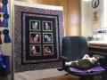
I have been wanting to make a Warm Wishes pattern for myself. I have finally figured out that I really prefer two color quilts. But....do you think the blue is too dark in the strips on this? I have just cut out enough to get a feel for it, as that seems to be the only way I can even begin to visualize a quilt.
Dina
Dina
 11-10-2013, 07:36 AM
#2
Power Poster
Join Date: Apr 2011
Location: Ontario, Canada
Posts: 17,827
I'm not sure why you would think it is too dark.
It looks like it picks up the darker blue in the mix of the print.
You have a good contrast to frame the blocks and it is creating a nice linear and tailored look.
It looks like it picks up the darker blue in the mix of the print.
You have a good contrast to frame the blocks and it is creating a nice linear and tailored look.
Last edited by QuiltE; 11-10-2013 at 07:41 AM.

 11-10-2013, 07:45 AM
#5
Super Member
Thread Starter
Join Date: Jan 2010
Location: Texas
Posts: 5,500
Thanks, I just needed to hear from someone else that it looked okay. It is darker than I had visualized, but...I do have trouble visualizing. The design wall in my head needs some work, I think. 
Dina
Dina
11-10-2013, 07:48 AM
#6
Senior Member
Join Date: Oct 2012
Posts: 812
I do that, too. Which is why I have so many stray 3 1/2" squares. 
If you're trying to emphasize the striped part, you have the right color, I think, but if it's the squares, it's too dark. The geometric lines are the first thing I saw, if that helps any.
It's definitely a pretty combination.
Hugs,
Charlotte
If you're trying to emphasize the striped part, you have the right color, I think, but if it's the squares, it's too dark. The geometric lines are the first thing I saw, if that helps any.
It's definitely a pretty combination.
Hugs,
Charlotte


Thread
Thread Starter
Forum
Replies
Last Post
