Go Back  Quiltingboard Forums > Main
Lemoyne star , which border looks best >

Lemoyne star , which border looks best

Lemoyne star , which border looks best

Thread Tools
 
Old 03-14-2016, 04:34 PM
  #21  
Senior Member
Thread Starter
 
patti p's Avatar
 
Join Date: Oct 2012
Location: Sandpoint, Idaho
Posts: 423
Default

[QUOTE=patti p;7493454]I just came from our local Hancock fabric store and they are Closing the store so upset. But a nice sale so I picked up two choices for a border but which one looks best or do you have any other suggestions[/QUOTEcab
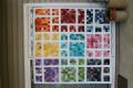
I up date my request for opinion here is another picture of mor choices from my stash
Attached Thumbnails image.jpg   image.jpg  
patti p is offline  
Old 03-14-2016, 06:34 PM
  #22  
Super Member
 
wesing's Avatar
 
Join Date: Jan 2009
Location: East TN
Posts: 2,727
Default

I like the yellow-green at the top, followed by the watercolor looking blue at the bottom. What do you think of them? Do you like the calmer look of the blenders?
wesing is offline  
Old 03-14-2016, 07:37 PM
  #23  
Super Member
 
Join Date: Sep 2010
Location: Lake Stevens, WA
Posts: 1,914
Default

They are both too busy! How about a marble or tone-on-tone that picks up the bright blue sashing intersection squares?
quilting cat is offline  
Old 03-14-2016, 11:26 PM
  #24  
Senior Member
 
K-Roll's Avatar
 
Join Date: Feb 2016
Location: SF Bay Area
Posts: 531
Default

I like the yellow green on the left side, it looks like a solid to me, just looks so lovely and soft.
K-Roll is offline  
Old 03-15-2016, 02:20 AM
  #25  
Super Member
 
WMUTeach's Avatar
 
Join Date: Dec 2010
Location: Portage, Michigan
Posts: 7,411
Default

I agree with those who have mentioned a solid color for your border that picks up a color from you Lemoyne Stars. When I first looked at your photo. My eyes kept going from the stars to the border fabric and got stuck on the print of the border. Seek out a more solid border so the beautiful stars will shine as the "stars of the show" and keep the floral print for another quilting opportunity. OK.... just my opinion. It is your quilt and you can finish it off in a way the pleases YOU and not us. Quilt on!
WMUTeach is offline  
Old 03-15-2016, 02:23 AM
  #26  
Senior Member
 
Join Date: Aug 2014
Posts: 335
Default

I like the one on the right...it brings out your colors more...I find the other too yellow somehow...IMHO...agree with Lynnie ...your quilt do what you like best and don't worry about the quilt police...lol
todiesmom is offline  
Old 03-15-2016, 03:00 AM
  #27  
Super Member
 
Join Date: Sep 2010
Location: Heart of Colorado's majestic mountains!
Posts: 6,026
Default

I would choose more of a blender similar to those in the background of your blocks to make the stars stand out. The patterned border choices are very pretty but deserve a venue of their own.
quilterpurpledog is offline  
Old 03-15-2016, 03:35 AM
  #28  
Super Member
 
jmoore's Avatar
 
Join Date: Feb 2011
Location: Boothbay Maine
Posts: 9,518
Default

out of your choices in Post #21, I like the aqua/blue on the right best... I think you're getting warmer. : )
jmoore is offline  
Old 03-15-2016, 03:41 AM
  #29  
Senior Member
 
Reba'squilts's Avatar
 
Join Date: Nov 2011
Location: South East Michigan...at the bottom of the thumb!
Posts: 730
Default

I am going with the turquoise!,
Reba'squilts is offline  
Old 03-15-2016, 03:59 AM
  #30  
Super Member
 
Join Date: Jul 2010
Posts: 6,430
Default

I vote for a solid turquoise rather than one of the busier colors.
carolynjo is offline  
Related Topics
Thread
Thread Starter
Forum
Replies
Last Post
bearisgray
Tutorials
23
05-20-2017 02:35 PM
Dayken
Pictures
220
10-13-2011 02:09 PM
moreland
Pictures
158
02-14-2011 09:33 PM
Hockeyrabbit
Main
8
07-14-2010 11:13 AM

Posting Rules
You may not post new threads
You may not post replies
You may not post attachments
You may not edit your posts

BB code is On
Smilies are On
[IMG] code is On
HTML code is On
Trackbacks are Off
Pingbacks are Off
Refbacks are Off


FREE Quilting Newsletter