Log in
Register
Forums
Main
QuiltingBoard Challenges & Contests
For Vintage & Antique Machine Enthusiasts
Pictures
Mission: Organization
Tutorials
Blocks of the Month and Week
Member Swaps and Round/Row Robins
Machine Embroidery
Introduce Yourself
Offline Events, Announcements, Discussions
Links and Resources
General Chit-Chat (non-quilting talk)
Recipes
QB Help Center
New Posts
Log in
Register
Threads
Threads
Posts
Advanced
Log in
Remember Me?
Forgot your Password?
QuiltingBoard's
privacy policy
Quiltingboard Forums
>
Main
>
Opinions please
Username
Remember Me?
Password
By logging into your account, you agree to our
Terms of Use
and
Privacy Policy
, and to the use of cookies as described therein.
Register
Forgot Password?
QuiltingBoard's
privacy policy
Register
FAQ
Calendar
Search
Today's Posts
Mark Forums Read
Vendor Directory
Opinions please
Reply
Subscribe
Page 2 of 12
<
1
2
3
4
>
Last
»
Thread Tools
07-13-2013, 08:44 AM
#
11
Emma S
Super Member
Join Date: Jun 2010
Location: Roseburg, OR
Posts: 2,976
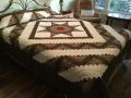
I like the dark blue (#2) because the brown in the quilt is dominant and the blue brings out the other blues more.
Reply
Emma S
View Public Profile
Send a private message to Emma S
Visit Emma S's homepage!
Find More Posts by Emma S
07-13-2013, 08:46 AM
#
12
irishrose
Super Member
Join Date: Nov 2010
Location: Cadillac, MI
Posts: 6,487
#2. #1 is too close to the color of some of the fabrics in the quilt and they colors bleed together, IMO. I like #2 better with the pretty floral batik in the wide border, too.
Reply
irishrose
View Public Profile
Send a private message to irishrose
Find More Posts by irishrose
07-13-2013, 08:49 AM
#
13
Raine54RN
Senior Member
Join Date: Dec 2012
Location: Moved from Missouri to California June2013 have 1 son 2 daughters, all grown and 2 cats
Posts: 568
Well ill have to be different, I like the blue. I think it flows nicely.
Reply
Raine54RN
View Public Profile
Send a private message to Raine54RN
Find More Posts by Raine54RN
07-13-2013, 08:57 AM
#
14
DebraK
Super Member
Join Date: Jan 2010
Location: West Coast
Posts: 9,267
either way works, but I think I like #2 a smidge better.
Reply
DebraK
View Public Profile
Send a private message to DebraK
Find More Posts by DebraK
07-13-2013, 09:08 AM
#
15
leaha
Super Member
Join Date: Aug 2009
Location: Ky. USA
Posts: 2,829
#1 with the darkest color on the out side to act like a frame, to keep the eye on the quilt and not wonder off
Reply
leaha
View Public Profile
Send a private message to leaha
Visit leaha's homepage!
Find More Posts by leaha
07-13-2013, 09:31 AM
#
16
QuiltnNan
Power Poster
Join Date: Mar 2011
Location: western NY formerly MN, FL, NC, SC
Posts: 51,430
i like the teal near the center and brown for the binding
Reply
QuiltnNan
View Public Profile
Send a private message to QuiltnNan
Find More Posts by QuiltnNan
07-13-2013, 09:37 AM
#
17
Sailorwoman
Senior Member
Join Date: Oct 2011
Location: Portland, Ontario, Canada
Posts: 413
Another vote for number 1.
Reply
Sailorwoman
View Public Profile
Send a private message to Sailorwoman
Find More Posts by Sailorwoman
07-13-2013, 09:37 AM
#
18
Tartan
Power Poster
Join Date: Mar 2011
Location: Ontario, Canada
Posts: 41,481
I vote for # 2. It lets the pattern of the quilt show more. When I look at the first one, all I notice is the brown.
Reply
Tartan
View Public Profile
Send a private message to Tartan
Find More Posts by Tartan
07-13-2013, 10:28 AM
#
19
Luv Quilts and Cats
Super Member
Join Date: May 2010
Location: New Hampshire
Posts: 3,699
I like number 1
Reply
Luv Quilts and Cats
View Public Profile
Send a private message to Luv Quilts and Cats
Find More Posts by Luv Quilts and Cats
07-13-2013, 12:26 PM
#
20
Prism99
Power Poster
Join Date: Dec 2008
Location: Western Wisconsin
Posts: 12,930
The first one for me too. The blue in the second one is so dark it "stops" the quilt before your eye travels to the border.
Reply
Prism99
View Public Profile
Send a private message to Prism99
Find More Posts by Prism99
Reply
Subscribe
Page 2 of 12
<
1
2
3
4
>
Last
»
Related Topics
Thread
Thread Starter
Forum
Replies
Last Post
Need opinions please on shops in Tennessee
Wendyjob1
Main
13
03-30-2009
05:48 AM
Opinions please!
rubia
Main
11
01-20-2009
06:47 AM
opinions please...hand quilting hoops
roselady
Main
5
12-11-2008
03:40 PM
opinions please
Cresha
Main
26
12-03-2008
02:40 AM
Need opinions of blocks, please
quiltykitty
Main
27
08-14-2008
02:12 PM
Back to Subforum
Main
View Next Unread
longarm practice question
Posting Rules
You
may not
post new threads
You
may not
post replies
You
may not
post attachments
You
may not
edit your posts
BB code
is
On
Smilies
are
On
[IMG]
code is
On
HTML code is
On
Trackbacks
are
Off
Pingbacks
are
Off
Refbacks
are
Off
Forum Rules
Thread Tools
Show Printable Version
Email this Page
FREE Quilting Newsletter
Receive main list
Receive special offers from partners
I agree to receive emails from the site. I can withdraw my consent at any time by unsubscribing.
Submit