
Too much of a good thing for border?


 02-01-2011, 04:55 AM
#94
Member
Join Date: Jan 2011
Location: NH
Posts: 37
Originally Posted by TanyaLynn
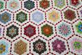
I would like a wide black border with the piano keys used as the binding. I think your quilt is striking.
02-01-2011, 08:16 AM
#96
Senior Member

Join Date: Oct 2010
Location: Kawartha Lakes, Ontario, Canada
Posts: 854
Was thinking the same thing! Beautiful quilt, but it needs more of the black to set off the patterns and not compete.
Originally Posted by TanyaLynn
I would like a wide black border with the piano keys used as the binding. I think your quilt is striking.
 02-01-2011, 12:40 PM
#98
Senior Member
Join Date: Jul 2010
Location: Eden, Utah; originally NY
Posts: 357
Originally Posted by sewingladydi
I love your quilt & I think your idea about a more solid border is good. I think it would set off your quilt better. But I am a little conservative, but I tend to like plainer borders when the quilt blocks have a lot going on.


Thread
Thread Starter
Forum
Replies
Last Post
DebQuilter50
Main
72
01-18-2021 07:22 AM
Favorite Fabrics
General Chit-Chat (non-quilting talk)
28
07-22-2011 09:50 AM
