
Affairs of the Heart Photos - Block #9


 03-28-2011, 03:10 AM
#169
Senior Member

Join Date: Nov 2010
Location: Probably not where I should be...
Posts: 691
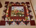
Patti - that is beautiful! I love the colors - I think that gold around the hearts would look nice -but- is there enough room? I wanted to do a contrasting color around my hearts, but I couldn't get the stitching to fit neatly between the heart scroll stitching and the hearts because my scrolls were already touching the hearts. It looks like yours are touching too. When I tried on mine, it just looked messy. I ended up using the same color (green) around my hearts as my scrolls because I didn't have to try to squeeze in another color between. I have green scrolls, green around the hearts and lavender on top of the hearts. Clear as mud? Anyway, the block is beautiful the way it is. It will be great no matter what you decide!
03-28-2011, 04:39 AM
#170
Power Poster
Join Date: Sep 2007
Posts: 18,726
Oh Lara, you are so right! The copper is touching. I'm worried about it just being too much..ya' know?? I think its going to be easy to over do with the Razzle Dazzle, maybe not so much with out choices, but this can get a little bit too shiny and flip over into the "gaudy" side...:wink: if I'm not careful. :)

Thread
Thread Starter
Forum
Replies
Last Post
QuiltswithConvicts
Blocks of the Month and Week
315
10-01-2013 06:29 PM
