
What's wrong with this quilt?
 11-20-2015, 05:10 AM
#31
Super Member

Join Date: Jul 2011
Location: St. Louis suburbs
Posts: 6,084
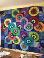
I don't see anything wrong with it. I think you must not like the colors together. I made a King size quilt for my daughter and hated it but everyone else loved it. So I looked and looked at it and figured out why I didn't like it and now I avoid making any quilts with that issue. My thing is I love white or snow in a quilt. Look at this lovely quilt and see what it is that you don't like and then make another with the type of fabrics you do like.
 11-20-2015, 05:14 AM
#32
Moderator

Join Date: Nov 2006
Location: on the Texas Coast
Posts: 4,020
It's not your color choices, and red was perfect for the middle color but because you framed the small blocks (the floaters) you lost the warm wishes look, if the floaters were the same size as the others it would have the look that the warm wishes pattern gives, I too have recently become enthralled with the 4 patch posies.
__________________
http://www.etsy.com/shop/kathykwilts?ref=ss_profile
http://www.etsy.com/shop/kathykwilts?ref=ss_profile
11-20-2015, 05:17 AM
#33
Super Member
Join Date: Oct 2013
Location: Tulsa, Ok
Posts: 4,582
I have felt that way about several of my quilts too!! While nothing is technically "wrong" with them, I just did not like them!! Sometimes I think it is because it didn't turn out as I expected or visualized in my mind, other times the colors just didn't work, or the value differences were too close or far apart. Or the variation between the size of prints or solids wasn't shat I was looking for. Or the pattern just didn't give you the look or drama you wanted. Hard to know, but if you just don't like it, try to learn from it and donate it!!
11-20-2015, 05:46 AM
#35
Super Member

Join Date: Jan 2011
Location: Monroe, IN
Posts: 2,283
You have chosen a color combination that isn't "trendy", but it works great. You used all the colors represented in the print, so yes, they play well together. I personally think it is a beautiful quilt, but then I am a "red" girl....LOL.
11-20-2015, 05:52 AM
#36
Power Poster
Join Date: Mar 2013
Location: Corpus Christi, Tx.
Posts: 16,105
Same here. Maybe it's the light colored fabric is too light and it's throwing you off but I really like it.
Originally Posted by BETTY62

The only thing I see wrong is that it doesn't belong to me. I love it.
 11-20-2015, 06:01 AM
#38
Super Member
Join Date: Jul 2010
Location: Flagstaff, Arizona
Posts: 9,475
I think it is a very nice quilt. Maybe there are too many bold colors in it??? At least your goal was met - that you wanted to try the pattern. I do that alot. I am sure the recipient will treasure it. We probably do our worst critiquing on our own projects and maybe it is not your favorite colors to work with.
11-20-2015, 06:01 AM
#39
Super Member
Join Date: Jul 2010
Location: SW Florida
Posts: 1,192
This has been an interesting thread to read, thanks for starting the discussion. For me, the yellow "frames" really stand out, and kind of take over the quilt. I think you have to be careful using yellow. It's been said, every quilt should have a bit of yellow... but IMHO, you can definitely overdo it! I agree with the assessment that the values of the rest of the fabrics are all too similar.
Also, I really like your print fabric. I think of warm wishes pattern as providing little frames around something interesting. IN this case, that's your print. But, by using the same print in the border, it seems like it makes the print all seem like a background, rather than the highlight of the quilt. Does that make sense?
Also, I really like your print fabric. I think of warm wishes pattern as providing little frames around something interesting. IN this case, that's your print. But, by using the same print in the border, it seems like it makes the print all seem like a background, rather than the highlight of the quilt. Does that make sense?
11-20-2015, 06:18 AM
#40
Super Member

Join Date: Mar 2011
Location: Maryland
Posts: 1,773
I really like the quilt and agree with the Chinese thing. I think the red center strip should have been cut a little wider. It looks like all three strips are the same width. I did this on my first WW quilt. It really makes a difference when the center strip is a little wider than the green and yellow that creates the frames. I like the little squares with the red frames around them. I think it really adds something to the quilt. Maybe one of the frames, either green or yellow, should have had a small design, blender, or something so it's not just solid fabric. It's going to look different when you quilt it also.

Thread
Thread Starter
Forum
Replies
Last Post
