
Need vote on color

 04-28-2016, 03:14 AM
#24
Super Member
Join Date: Sep 2010
Location: Heart of Colorado's majestic mountains!
Posts: 6,026
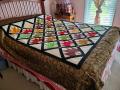
I also think the blue solid in the border complements the hankies. But like cjsews, I think it needs to be a softer value of the blue that is in the hankie. Nice idea for a quilt and can showcase special things from the past.

 04-28-2016, 04:03 AM
#27
Senior Member
Join Date: Oct 2012
Location: Pearland, TX
Posts: 406
I think your butterflies are wonderful. Since I am used to seeing butterflies during the spring and summer, I would choose the light green thin border to represent the stems of the flowers the butterflies love so much. After that I would select a lighter blue for the springtime sky. The brown border in the second picture looks like autumn to me, and the blue of your first picture and the black in your second one seem too much like storm clouds. Is that too much of "waxing poetic" to make sense?
04-28-2016, 05:32 AM
#28
Member

Join Date: Oct 2011
Location: St. Charles, MO
Posts: 76
My opinion only - the blue is too hard/heavy for the soft butterflies. The thin green border really sets the butterflies into a 'garden'. I would try to find a soft green/blue floral, I really like the floral. But I wouldn't do as wide as the blue shown. I still look at that, and could see a very soft pink/green watercolor floral too! Very garden-y.
04-28-2016, 05:33 AM
#29
Member
Join Date: Oct 2011
Location: St. Charles, MO
Posts: 76
Originally Posted by youngduncan

I think your butterflies are wonderful. Since I am used to seeing butterflies during the spring and summer, I would choose the light green thin border to represent the stems of the flowers the butterflies love so much. After that I would select a lighter blue for the springtime sky. The brown border in the second picture looks like autumn to me, and the blue of your first picture and the black in your second one seem too much like storm clouds. Is that too much of "waxing poetic" to make sense?

Thread
Thread Starter
Forum
Replies
Last Post
