Go Back  Quiltingboard Forums >
  • Main
  • Mexican Star quilt - sashing help! >
  • Mexican Star quilt - sashing help!

  • Mexican Star quilt - sashing help!

    Thread Tools
     
    Old 02-24-2019, 05:12 AM
      #21  
    Super Member
     
    JENNR8R's Avatar
     
    Join Date: Dec 2010
    Location: Manassas, VA
    Posts: 2,018
    Default

    I'd pick white. It would look very modern with all of the negative space.
    JENNR8R is offline  
    Old 02-24-2019, 06:25 AM
      #22  
    Super Member
     
    eparys's Avatar
     
    Join Date: Sep 2008
    Location: New England, USA
    Posts: 2,972
    Default

    I love your fabrics - and this quilt has been on my bucket list for a while. Personally, I like #2 - but #1 would be a close second. The reason that I put #2 as my first choice is that it has some depth as well as movement but it is visually different from the fabrics in the block. #3 is just too plain for me and #4's pattern is too symmetrical in contrast to the movement in the blocks. This all being said (lol) my guess is what ever you choose the quilt will look great. Big question - Which one do you like??
    eparys is offline  
    Old 02-24-2019, 08:13 AM
      #23  
    Junior Member
     
    Join Date: Sep 2011
    Location: Not Quite Far Eastern Canada
    Posts: 231
    Default

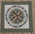
    [ATTACH=CONFIG]609148[/ATTACH]Finally figured out how to do my photo drop. So much for drag and drop. This is the ones in green of which I was speaking. Kinda forgot the red...duh.
    Attached Thumbnails Click image for larger version

Name:	IMG_0581.jpeg
Views:	339
Size:	1.74 MB
ID:	609148  
    Freckles48 is offline  
    Old 02-24-2019, 08:37 AM
      #24  
    Super Member
    Thread Starter
     
    Join Date: Nov 2014
    Location: Ontario Canada
    Posts: 1,869
    Default

    Originally Posted by eparys
    I love your fabrics - and this quilt has been on my bucket list for a while. Personally, I like #2 - but #1 would be a close second. The reason that I put #2 as my first choice is that it has some depth as well as movement but it is visually different from the fabrics in the block. #3 is just too plain for me and #4's pattern is too symmetrical in contrast to the movement in the blocks. This all being said (lol) my guess is what ever you choose the quilt will look great. Big question - Which one do you like??
    I donate them all, so it doesn't really matter if I like it or not, I just want to know which one looks best!
    MarionsQuilts is offline  
    Old 02-24-2019, 08:38 AM
      #25  
    Super Member
    Thread Starter
     
    Join Date: Nov 2014
    Location: Ontario Canada
    Posts: 1,869
    Default

    Originally Posted by Freckles48
    [ATTACH=CONFIG]609148[/ATTACH]Finally figured out how to do my photo drop. So much for drag and drop. This is the ones in green of which I was speaking. Kinda forgot the red...duh.
    That's gorgeous!

    Now that I know how to do it, I might do another one that is really vibrant!
    MarionsQuilts is offline  
    Old 02-24-2019, 01:13 PM
      #26  
    Super Member
     
    Join Date: Jul 2008
    Location: Keller, TX
    Posts: 1,947
    Default

    #1 Great Work!
    Lady Diana is offline  
    Related Topics
    Thread
    Thread Starter
    Forum
    Replies
    Last Post
    tezell0801
    Main
    51
    07-06-2014 04:59 AM
    spartan quilter
    Pictures
    87
    06-24-2013 10:54 AM
    Linda71
    Pictures
    138
    08-01-2011 04:42 PM

    Posting Rules
    You may not post new threads
    You may not post replies
    You may not post attachments
    You may not edit your posts

    BB code is On
    Smilies are On
    [IMG] code is On
    HTML code is On
    Trackbacks are Off
    Pingbacks are Off
    Refbacks are Off


    FREE Quilting Newsletter