Hey, thought you guys might be interested in this ... not sure why I didn't do it sooner! This is a digital test of my layout — which I had created using scanned images of the actual HST blocks — combined with the top binding color choices. I still love the red, but the navy blue is the winner for me. It really pulls the whole thing together, doesn't it?
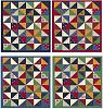
(Yeah, please ignore the width of the binding. That's not accurate!)