
Contrast in Quilt: Enough? Too Much?
 08-26-2020, 07:38 AM
#1
Super Member
Thread Starter
Join Date: Dec 2015
Location: Ontario, Canada
Posts: 4,369
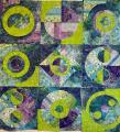
I've begun a new wall hanging and had a few acrylic templates made. Now the question is, what is too much contrast and what is not enough?
Originally, my background fabric was going to be the lime green, but survey say, that is "too much", so I am going with the multi-colour, but I still want the pop of the lime...Do you think over the course of the entire wall hanging, I can have some block backgrounds in the lime? (I know I can do anything I want, but should I?)
Do you find the block with the multi-colour background has enough "pop?
There is also a version of the Drunkards Path still to come that I can add some lime green to.
I just don't want the quilt to be flat-looking.
Ideas, comments?
Here are the two blocks I have done so far, although they aren't sewn together as I may end up mix and matching them .
Thanks, Watson
 08-26-2020, 07:48 AM
#2
Super Member
Join Date: Aug 2018
Location: Greater Peoria, IL -- just moved!
Posts: 6,167
You know I'm going to end up with "your quilt/your way" but I like the second option a bit better.
Have you ever looked at the book Casting Shadows by Colleen Wise? I think the cover quilt could be adapted for drunkard's path, and using a lot of the lime green (when is too much, really...) along with the shadows along with color placement in the drunkards path blocks to be stunning....
https://www.amazon.com/Casting-Shado...-3&tag=mh0b-20
Dirt cheap used -- just watch shipping charges.
08-26-2020, 08:07 AM
#5
Super Member
Join Date: May 2017
Location: Sunny Florida
Posts: 4,431
Love the blocks and the fabrics. Lime green is a favorite here.
Looking at the second, the lime against the green fabrics gets lost. The greens fade into each other. If you want contrast the greens need the darker blue. If you wanted blended greens, then they work.
The next question is what look are you going for in your quilt? Soft, quiet and blended? or do you want one with contrast as you describe?
Again, as you know there is no right/wrong. It depends on the look you want.
I like the layout with contrast fabrics in the first block. You might try that contrast with the DP center in the second block.
08-26-2020, 08:08 AM
#6
Senior Member

Join Date: May 2011
Location: Western Washington
Posts: 971
I like the lime green choice of color but I'm in agreement with SallyS that the lime green in the background loses the circles in the pattern on the right. On the other hand I think the block on the left doesn't have enough lime green to accomplish what you want, maybe the outside corners should be where you use lime background.

 08-26-2020, 01:50 PM
#9
Super Member
Thread Starter
Join Date: Dec 2015
Location: Ontario, Canada
Posts: 4,369
Bear, I'm thinking there will be about 12 blocks altogether...not sure yet.
I am going to change out the lime background on the big round block to the same background as the rest and do all the circles in the lime green for cohesiveness.
Thanks for your help!
Watson
I am going to change out the lime background on the big round block to the same background as the rest and do all the circles in the lime green for cohesiveness.
Thanks for your help!
Watson
