Go Back  Quiltingboard Forums >
  • Main
  • pattern layout? >
  • pattern layout?

  • pattern layout?

    Old 07-29-2013, 09:23 AM
      #41  
    Super Member
     
    btiny36's Avatar
     
    Join Date: Apr 2010
    Location: Somewhere in the Heart of grain field
    Posts: 1,826
    Default

    Love the colors I pick #2
    btiny36 is offline  
    Old 07-29-2013, 05:38 PM
      #42  
    Power Poster
     
    alikat110's Avatar
     
    Join Date: Oct 2010
    Location: Waco, Texas
    Posts: 15,138
    Default

    If your still asking....#4.
    alikat110 is offline  
    Old 07-29-2013, 05:40 PM
      #43  
    Junior Member
     
    iwillquilt's Avatar
     
    Join Date: Nov 2010
    Location: Mid-Missouri
    Posts: 246
    Default

    I like the pattern effect on #2 but I personally would have to try putting the darks together and the lights together. But really they are all pretty. Close your eyes and point to one.
    iwillquilt is offline  
    Old 07-29-2013, 07:23 PM
      #44  
    Senior Member
     
    zzmom's Avatar
     
    Join Date: Sep 2011
    Location: Oregon
    Posts: 868
    Default

    I like the 1st one. Pretty fabrics!
    zzmom is offline  
    Old 07-29-2013, 07:57 PM
      #45  
    Super Member
     
    Nanny's dollface's Avatar
     
    Join Date: Feb 2013
    Location: So. California
    Posts: 1,447
    Default

    I like #4 the best.
    Nanny's dollface is offline  
    Old 07-30-2013, 03:02 AM
      #46  
    Member
     
    Join Date: Feb 2012
    Location: Powder Springs, Georgia
    Posts: 15
    Default

    I like all, but my favorite is #1.
    mtchick is offline  
    Old 07-30-2013, 03:15 AM
      #47  
    Senior Member
     
    Join Date: Jul 2009
    Location: Bangor North Wales
    Posts: 353
    Default

    I really like the first one.
    quiltyjax is offline  
    Old 07-30-2013, 03:15 AM
      #48  
    Member
     
    Join Date: Oct 2011
    Posts: 5
    Default

    I like both layout,share pattern.
    eyonne is offline  
    Old 07-30-2013, 03:50 AM
      #49  
    Super Member
     
    WMUTeach's Avatar
     
    Join Date: Dec 2010
    Location: Portage, Michigan
    Posts: 7,494
    Default

    I like Number 2 with the kitty walking by. It shows off the light/dark aspect of your squares so well. It is interesting and....I just like it.
    WMUTeach is offline  
    Old 07-30-2013, 04:18 AM
      #50  
    Super Member
     
    Join Date: Apr 2012
    Location: Saginaw Michigan
    Posts: 2,305
    Default

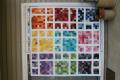
    How fun, interesting how moving them around makes such a difference. At first I thought I liked the second one the best, but the last one is great too! You have a hard decision but any of them will be great.
    Retired Fire Chief is offline  
    Related Topics
    Thread
    Thread Starter
    Forum
    Replies
    Last Post
    misoop
    Main
    8
    10-14-2014 02:37 PM
    souffoue
    Main
    4
    06-14-2014 10:33 AM
    chairjogger
    Pictures
    11
    02-07-2012 02:24 PM

    Posting Rules
    You may not post new threads
    You may not post replies
    You may not post attachments
    You may not edit your posts

    BB code is On
    Smilies are On
    [IMG] code is On
    HTML code is On
    Trackbacks are Off
    Pingbacks are Off
    Refbacks are Off


    FREE Quilting Newsletter