Go Back  Quiltingboard Forums > Pictures
You Win Some, You Lose Some >

You Win Some, You Lose Some

You Win Some, You Lose Some

Thread Tools
 
Old 02-22-2019, 03:54 PM
  #1  
Super Member
Thread Starter
 
Watson's Avatar
 
Join Date: Dec 2015
Location: Ontario, Canada
Posts: 4,349
Default You Win Some, You Lose Some

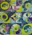
I had high hopes for this black and white quilt, but I shouldn't have put the bold print in. I thought it would break things up a bit, but it doesn't work. Oh well...some charity will be pleased to have it once I get it quilted.

The picture doesn't do the colours justice. The lighter long strip is actually pure white with a swirl in it.

Watson

[ATTACH=CONFIG]609050[/ATTACH]
Attached Thumbnails bwquilt.jpg  

Last edited by Watson; 02-22-2019 at 03:56 PM.
Watson is offline  
Old 02-22-2019, 04:00 PM
  #2  
Super Member
 
GingerK's Avatar
 
Join Date: Jul 2010
Location: Ontario, Canada
Posts: 3,513
Default

Monochromatic and very modern. I think I might get it quilted up and enter it in a couple of fairs this summer and then donate it if it still doesn't appeal to you. I kind of like the bold print. It attracts my eyes--unless that wasn't the result you were going for.
GingerK is offline  
Old 02-22-2019, 04:04 PM
  #3  
Super Member
 
Join Date: Aug 2013
Posts: 9,300
Default

I disagree—The bold print was not a mistake. It gives a lively pick-me -up on an otherwise serious look.
zozee is offline  
Old 02-22-2019, 04:07 PM
  #4  
Super Member
 
Join Date: Jul 2011
Location: Cascade, Co
Posts: 1,391
Default

Unless you physically can see the quilt, it is difficult to determine whether it is too bold. From the computer It doesn't appear too bold. I like it. You can always send it my way if you decide you really don't like it. Things tend to grow on you after a while so who knows one day you might just love it.
BSKTLOFR-QUILTER is offline  
Old 02-22-2019, 04:40 PM
  #5  
Member
 
Join Date: Dec 2012
Location: Sweden
Posts: 23
Default

I think the bold print looks great!
Chantal is offline  
Old 02-22-2019, 04:45 PM
  #6  
Power Poster
 
Join Date: Mar 2011
Location: Ontario, Canada
Posts: 41,464
Default

I like the pop of the big print! Quilt it up and enjoy!
Tartan is offline  
Old 02-22-2019, 04:46 PM
  #7  
Super Member
 
Join Date: Jun 2017
Location: Southern Idaho
Posts: 1,208
Default

I also like the bold print! Gives the quilt a quirky vibe.
Jules51 is offline  
Old 02-22-2019, 05:32 PM
  #8  
Super Member
 
Join Date: Feb 2018
Location: North Carolina
Posts: 2,414
Default

I like it! That bold print is good! Just hang on to it for a little while. You might find that you really like this one.... a lot!!
SillySusan is offline  
Old 02-22-2019, 05:42 PM
  #9  
Power Poster
 
nativetexan's Avatar
 
Join Date: Feb 2009
Location: home again, after 27 yrs!
Posts: 19,388
Default

actually the little print is fine. sort of makes me think of little windows in the City.
nativetexan is offline  
Old 02-22-2019, 06:13 PM
  #10  
Super Member
 
Join Date: Jan 2012
Posts: 4,783
Default

It's very pretty, and I like the bold print. When I imagine the quilt without it, it looks kind of blah. I believe every quilt needs a little zinger to avoid looking blah.
JustAbitCrazy is offline  
Related Topics
Thread
Thread Starter
Forum
Replies
Last Post
kay carlson
Main
16
07-27-2013 04:25 PM
DJ
Pictures
15
06-11-2013 09:18 AM
quiltsRfun
Main
15
06-20-2011 04:08 AM
user15356
General Chit-Chat (non-quilting talk)
4
02-13-2011 10:09 AM

Posting Rules
You may not post new threads
You may not post replies
You may not post attachments
You may not edit your posts

BB code is On
Smilies are On
[IMG] code is On
HTML code is On
Trackbacks are Off
Pingbacks are Off
Refbacks are Off


FREE Quilting Newsletter