
What did I do wrong???
 10-20-2010, 03:53 AM
#61
Junior Member

Join Date: Apr 2010
Location: Wisconsin
Posts: 234
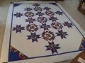
It is beautiful, I do like the second better, it seems to separate the fabrics better, with the same colored flowers it did run together a bit. I think if the dark blue had something other than the large flowers of the same color, it would have been fine.
 10-20-2010, 04:36 AM
#63
Senior Member
Join Date: Jul 2010
Location: Tampa, FL
Posts: 542
Originally Posted by Prism99
These are beautiful quilts!
In terms of a wow factor, think about using additional colors. Blue is calming in practically all of its incarnations, and especially in florals, so using all blues and whites pretty much guarantees a calm quilt. I always offset blue fabrics with pink fabrics to add a little dynamic "tension". You might look to add pink florals to your stash, and also fabrics that have both pink and blue flowers (so you have some transition fabrics to work with).
It seems to me that many of your florals are of large flowers in one color. Try adding in some smaller sized florals, and also some non-floral fabrics for variations in texture. For example, even if you wanted to stick with all blues, some ocean blues and sky blues would add a lot of textural variation.
10-20-2010, 04:49 AM
#64
Super Member
Join Date: Aug 2010
Location: Jacksonville, FL
Posts: 1,389
I love both of them, the one on the bed is especially stunning!
When working with florals you need to consider how much background shows. When flowers are spaced far apart, the individual 'square' can sometimes look like it is a totally different fabric and changes the 'look' of the design. And, as someone has already said, change the scale ... mix small, medium and large. Add in a little tone on tone. Not everything can be a 'star'. Some fabrics need to be the supporting actress!
Although it may not be what you were expecting, I think what you created on the bed looks like a very unique, original quilt instead of a 'cookie cutter' trip around the world! Hey, you're a designer and didn't know it!
 10-20-2010, 05:05 AM
#68
Junior Member
Join Date: Jun 2010
Location: Poconos, PA
Posts: 125
It is a great quilt and you did a great job. The only thing I can think of is that perhaps adding another color other than blue may give it the wow factor. Maybe a blue with some pink in it might work. I don't know if it would work or not but a jolt of another color may perk it up a bit. Just a suggestion as I like it the way it is now.
10-20-2010, 05:06 AM
#69
Super Member

Join Date: Jan 2009
Location: Alabama
Posts: 3,371
I do like them both - I think I would just have used smaller prints in it. That might be what is irking you. Having said that - I do like them.
If you don't like it, I'm sure you will be able to find happy homes for them both ;)
If you don't like it, I'm sure you will be able to find happy homes for them both ;)

Thread
Thread Starter
Forum
Replies
Last Post
