Go Back  Quiltingboard Forums > Pictures
setting stone help >

setting stone help

setting stone help

Thread Tools
 
Old 11-22-2010, 08:07 AM
  #51  
Member
 
SharonG's Avatar
 
Join Date: Sep 2010
Location: Crystal River, Florida
Posts: 28
Default

I like the brown and gold reversed best. Gives a feel of symmetry and elegance.
SharonG is offline  
Old 11-22-2010, 08:49 AM
  #52  
Junior Member
 
QuiltingB's Avatar
 
Join Date: Mar 2010
Location: Green River, Utah
Posts: 236
Default

Originally Posted by SharonG
I like the brown and gold reversed best. Gives a feel of symmetry and elegance.
I like the brown and gold, as well, for the same reason.
QuiltingB is offline  
Old 11-22-2010, 08:50 AM
  #53  
Power Poster
 
RedGarnet222's Avatar
 
Join Date: Jan 2009
Location: Reno, Nv
Posts: 16,521
Default

I think the light blue pops out and enhances the quilt. But honestly I think it should be a much lighter blue.
RedGarnet222 is offline  
Old 11-22-2010, 08:53 AM
  #54  
Senior Member
 
skavanau's Avatar
 
Join Date: Jan 2010
Location: Independence VA
Posts: 555
Default

I like the dark blue.. It makes it pop..
skavanau is offline  
Old 11-22-2010, 08:55 AM
  #55  
Super Member
 
humbird's Avatar
 
Join Date: Mar 2008
Posts: 1,281
Default

I also like the idea of 9 patch with the brown and gold. Really like you S&W!
humbird is offline  
Old 11-22-2010, 09:03 AM
  #56  
Junior Member
 
Ellie377073's Avatar
 
Join Date: Aug 2010
Location: Pennsylvania
Posts: 166
Default

I like the blue. It makes it pop.
Ellie377073 is offline  
Old 11-22-2010, 10:19 AM
  #57  
Super Member
Thread Starter
 
franie's Avatar
 
Join Date: Mar 2010
Location: SW Iowa
Posts: 6,550
Default

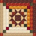
Oh My--I opened a big can of worms! I never thought I would get such diverse opinions. Not sure either block won the vote. LOL I might try the light tan or gray too if I have anything in that color. I don't have any of the fabric left of the owl fabric. Some of the blocks minus the corners were given to me--plus a stack to be cut and sewn. So I finished all the blocks and added the corners in brown and came up with the setting out of my head. Still not sure where this is going...
franie is offline  
Old 11-22-2010, 10:48 AM
  #58  
Senior Member
 
quilter on the eastern edge's Avatar
 
Join Date: Aug 2010
Location: Newfoundland, Canada
Posts: 645
Default

Originally Posted by maine ladybug
I like the blues ones in the second picture, I think they bring out the colors best.
I agree! The blue really makes the centres "pop".
quilter on the eastern edge is offline  
Old 11-22-2010, 10:53 AM
  #59  
Senior Member
 
Rachel's Avatar
 
Join Date: Sep 2009
Location: Iowa
Posts: 879
Default

I like the "boring reversed brown and gold". sorry.. tee hee
Rachel is offline  
Old 11-23-2010, 03:04 AM
  #60  
Junior Member
 
Join Date: Jul 2010
Posts: 250
Default

Love your stack'n whack. I get stuck with settings too sometimes. You have a lot of choices. You don't want to take the eye away from those gorgeous stack'n whack blocks. I think I like the brown paiseley too. Can't wait to see it.
texaspam is offline  
Related Topics
Thread
Thread Starter
Forum
Replies
Last Post
karielt
Main
6
04-15-2020 08:31 AM
sondray
Links and Resources
2
09-29-2009 04:17 PM
sondray
Links and Resources
0
04-06-2009 07:15 AM
RisingPhoenix
Main
25
03-21-2008 01:48 PM
patricej
Pictures
21
02-13-2008 06:31 AM

Posting Rules
You may not post new threads
You may not post replies
You may not post attachments
You may not edit your posts

BB code is On
Smilies are On
[IMG] code is On
HTML code is On
Trackbacks are Off
Pingbacks are Off
Refbacks are Off


FREE Quilting Newsletter