
Whats wrong with this quilt/wallhanging?

 01-05-2013, 06:42 AM
#62
Super Member

Join Date: Dec 2008
Location: Michigan
Posts: 2,916
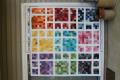
I would replace the square gold background upper left with light. Then i would like to see how it looks with all the triangles in gold. Then I would like to see it with the triangles all going the same direction.
At first I didn't see the pattern that the triangles were laid out in, but now I see it. It looks a bit chaotic, but I get it. I like what you're doing with this and look forward to seeing your end product!
At first I didn't see the pattern that the triangles were laid out in, but now I see it. It looks a bit chaotic, but I get it. I like what you're doing with this and look forward to seeing your end product!
 01-05-2013, 06:49 AM
#64
Senior Member
Join Date: Mar 2011
Location: Michigan
Posts: 757
01-05-2013, 06:53 AM
#65
Super Member

Join Date: Aug 2011
Location: Northeast Iowa
Posts: 1,638
Good Morning, I would rearrange the blocks and the gold triangles, try working them into a said block... change the pattern you are trying to form- light to dark. Put the triangles the same direction. It will wow you in the end.
01-05-2013, 06:54 AM
#67
Super Member
Join Date: Dec 2010
Location: Portage, Michigan
Posts: 9,521
I would consider putting black sashing between the blocks or set the blocks in sets of four and then add the sashing to calm down the "business" of the squares you have made. I like the colors but I agree with others that the triangles pop out too much as presented. A different order that focus on the direction of triangles might help also.
 01-05-2013, 07:21 AM
#69
Junior Member

Join Date: Mar 2011
Location: Whitehouse, OH
Posts: 130
I'm certainly not very experienced, but it "feels" a little unbalanced to me. I think I'd rearrange the squares so when squinting, the darks either flow out from the center or frame a lighter center, or have alternating rows of light to dark, then dark to light. The yellows might work better then, but they do seem a bit distracting in this layout.
Neat fabrics, though. I think I'd like the polka dot as a binding.
Neat fabrics, though. I think I'd like the polka dot as a binding.
01-05-2013, 07:42 AM
#70
Member
Join Date: Mar 2011
Location: Washington
Posts: 75
This is a 36 block square. 24 have gold centers and 10 have various other colored center. Balancing color in any quilt is important - no matter how you rearrange these squares, the color balance is going to pop and right now all that is "popping" is gold, gold, gold. If that is what you want, great, but what if you changed out some of the gold for more subdued - look at just the bottom row - looks better color wise.
Secondly - your layout might look more appealing if more controlled. Study quilts that look scrappy and why they are appealing - usually they will have alternating layout designs. Like upper left hand corner, bottome right hand corner all the way across that row - then the next row will be reversed and on opposite corners - then third row back to the same as first fow. Hope this makes sense.
This much you do know - you know you don't like what you have now - and can learn why. Don't give up, this has potential and will be beautiful when finished and you will know a whole lot more for the next creative project.
Cheryl

Thread
Thread Starter
Forum
Replies
Last Post
pollyjvan9
Pictures
26
08-01-2012 04:39 AM
luvTooQuilt
Main
7
07-12-2011 01:36 PM
