Go Back  Quiltingboard Forums > Main
Your opinions please - on the border >

Your opinions please - on the border

Your opinions please - on the border

Thread Tools
 
Old 08-23-2011, 04:17 AM
  #31  
Senior Member
 
Join Date: Jan 2011
Posts: 563
Default

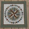
What if you used a moderately-narrow, brown border first - to frame your beautiful work, and THEN put the original fabric as a slightly larger border and then bind in a thin brown binding ....

I love to see the original fabric along side the composite pieces; wouldn't want to have to turn it over to get the impact .... Someone not familiar with the technique would lose the total intricacy/concept of the varied blocks ... and the workmanship involved.

Just one opinion .... ;)
CorneliaVa is offline  
Old 08-23-2011, 04:17 AM
  #32  
Super Member
 
AnnT's Avatar
 
Join Date: Oct 2009
Location: Maryville, TN
Posts: 2,008
Default

I like the brown.
AnnT is offline  
Old 08-23-2011, 04:18 AM
  #33  
Senior Member
 
Join Date: Jul 2010
Posts: 898
Default

I personally like the octagon blocks. I can't tell you why but I do.
Have fun and it will be great however you do it. thanks for sharing and asking. :)
theresa.redington is offline  
Old 08-23-2011, 04:19 AM
  #34  
Super Member
 
sahm4605's Avatar
 
Join Date: May 2010
Location: Blue Springs, MO
Posts: 2,167
Default

I would do the print with the circles inside and then a larger boarder in the brown and then bind it in brown.
sahm4605 is offline  
Old 08-23-2011, 04:30 AM
  #35  
Junior Member
 
dkquilter's Avatar
 
Join Date: Jul 2011
Location: Weston, WV
Posts: 102
Default

I like the brown line too!
dkquilter is offline  
Old 08-23-2011, 04:30 AM
  #36  
Senior Member
 
Selena's Avatar
 
Join Date: Mar 2011
Location: Southern MS
Posts: 594
Default

I think the octagon print and then a brown border around it.
Selena is offline  
Old 08-23-2011, 04:31 AM
  #37  
Senior Member
 
Join Date: Feb 2011
Location: Victorian Sweatshop
Posts: 863
Default

I agree with Irish Rose. I think the brown strip makes it.
redmadder is offline  
Old 08-23-2011, 04:33 AM
  #38  
Power Poster
 
QuiltnNan's Avatar
 
Join Date: Mar 2011
Location: western NY formerly MN, FL, NC, SC
Posts: 51,432
Default

I think the brown shows off the blocks better
QuiltnNan is offline  
Old 08-23-2011, 04:35 AM
  #39  
Super Member
 
eparys's Avatar
 
Join Date: Sep 2008
Location: New England, USA
Posts: 2,957
Default

Originally Posted by wolfkitty
I think irish rose may be on to something. I think a border of brown and then the print, then brown binding would stand out nicely!
I so totally agree here.

Also - I am partial to the fabric placement on the left - The repetitive rectangles closer to the Quilt form a visual line and to my eyes looks better closest to the quilt.
eparys is offline  
Old 08-23-2011, 04:44 AM
  #40  
Senior Member
 
Traditional's Avatar
 
Join Date: Sep 2010
Location: Ohio
Posts: 823
Default

I like the brown.
Traditional is offline  
Related Topics
Thread
Thread Starter
Forum
Replies
Last Post
hrtireladie11185
Main
18
10-18-2017 03:45 AM
AFQSinc
Main
15
06-19-2012 12:35 PM
DeneK
Pictures
29
02-23-2011 02:22 PM
hcarpanini
Pictures
48
03-07-2010 04:05 AM
vbourck
Main
42
12-18-2009 07:06 PM

Posting Rules
You may not post new threads
You may not post replies
You may not post attachments
You may not edit your posts

BB code is On
Smilies are On
[IMG] code is On
HTML code is On
Trackbacks are Off
Pingbacks are Off
Refbacks are Off


FREE Quilting Newsletter