Crazy Eights
Subscribe
#41
orangeroom , 08-28-2012 10:30 AM
Super Member
 11-11-2025
Nice colors! We're all different. I prefer to continue the quilting all the way to the edge of the quilt. That way it doesn't look like I've stopped quilting.


#43

nstitches4u , 08-28-2012 01:53 PM
Super Member
Very pretty!

#45

ube quilting , 08-28-2012 03:55 PM
Power Poster
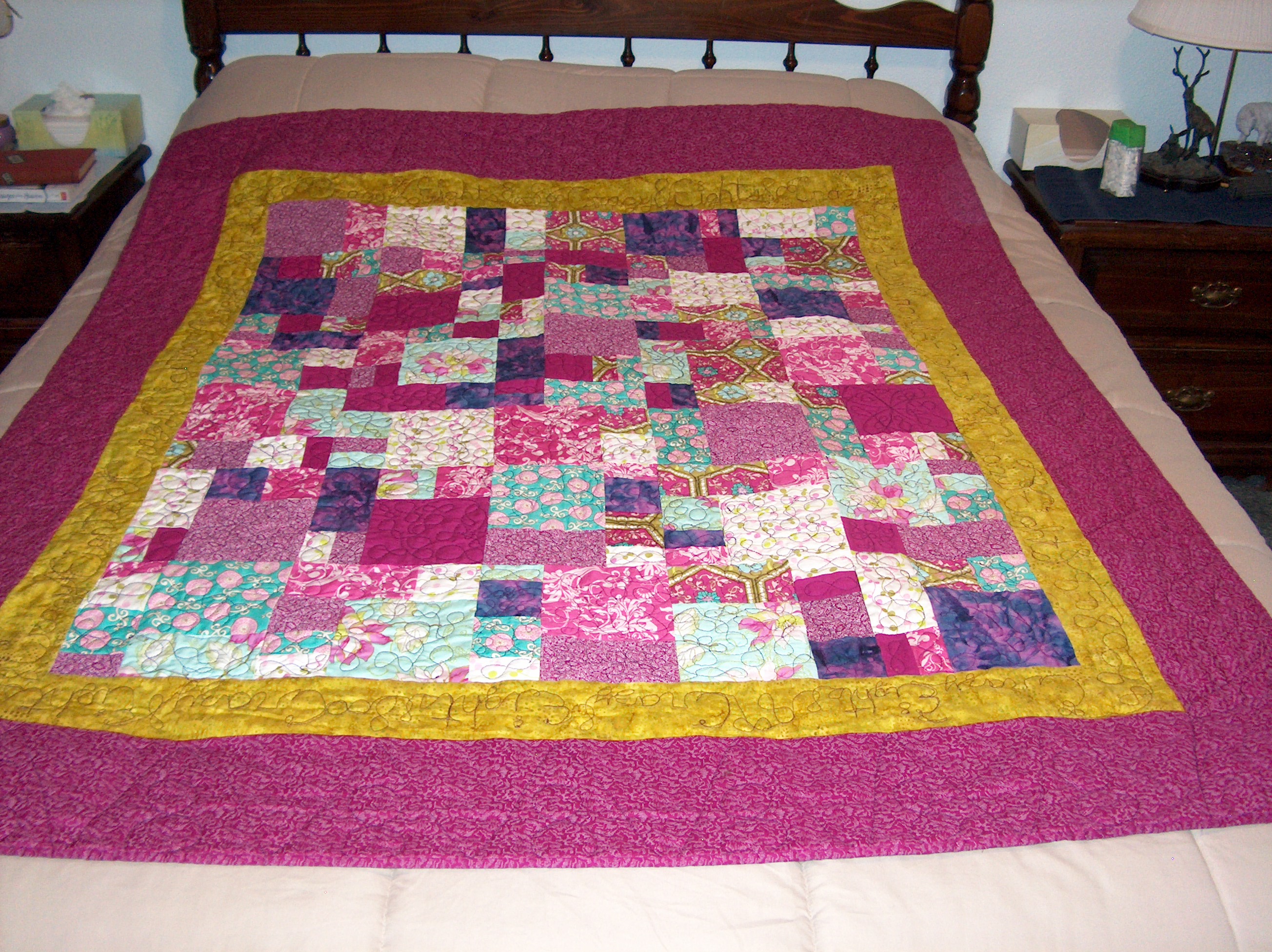
what a great idea. A very pretty quilt and I love the writing on the wall! What do you call the color of the first border? It is fab with the rest of the quilt!
peace
peace
#47

Wonderful colors and I like that you did the writing in the quilt. If I could do this good on my LA, I would be doing the happy dance. I have only quilted swirly curls and I did write messages in a quilt for a friend who was heading to cancer treatments. Great job.
#48
Quote:
I am never good with describing colors. The outer border is a small print with the background being similar to the solid light purple (?) in the main body of quilt. I am very fortunate to have as a member of my guild a lady who owned a quilt shop in the past. She still has many of the bolts of fabric she kept. I gave her some scraps and asked if she might have something that would match well with the light purple and she found the outer border. So I bought 2 yards from her. Perhaps 'mauve' is the word I want???The little inner border that is gold (?) is a mottled batik. Hope that helps. I am really not good at trying to match color combos which is why I like doing scrappy quilts best. :-)Originally Posted by ube quilting
what a great idea. A very pretty quilt and I love the writing on the wall! What do you call the color of the first border? It is fab with the rest of the quilt! peace
#49
burchquilts , 08-30-2012 02:30 PM
Super Member
Quote:
I love the fabrics/colors, too! I wasn't familiar with the "Crazy Eights" patterm before but I sure love this quilt! Great job -- both on the piecing & on the quilting!!Originally Posted by joysewer
That is really pretty!!!! I love the colors!
#50
I finished my quilt yesterday when I added on the label. I saw this idea on Fons & Porter last Sunday and so I improvised making an envelope. I forgot to allow for directional fabric so this one is a bit more noticable since I have the fabric design going at an angle but wanted to show you a nice way to make the label not so conspicious. If you did it all in the colors of the backing, it would hardly be noticable at all. All four sides of my envelope open.