
Background color
 08-30-2023, 08:13 AM
#1
Super Member
Thread Starter

Join Date: Jul 2018
Location: Southern USA
Posts: 1,987
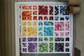
Good morning quilters, my sister wants to make the Chandelier or Bead pattern. She wants to use light soft pinks on white. I told her I don’t think she would have enough contrast and everything might just blend instead of pop. I know she likes blues too so I suggested a light blue as a background but what do you quilters think? I know she liked my granddaughter’s changing mat (picture below) and it has those colors in the fabric although it wasn’t pieced, just whole cloth. Give us your opinion or suggestions please. Thank you
 08-30-2023, 08:23 AM
#2
Super Member
Join Date: May 2013
Location: Ballwin, MO
Posts: 4,211
If the outside of those petals are pink, it's a very pale pink, almost white. I would not suggest using pink that's recognizable as pink, on light blue. They would have virtually the same value, and the eye would struggle to differentiate between them.
Do you know about converting photos to grayscale in order to check the relative values? You could take a photo of soft pink fabrics on white, de-saturate until it's grayscale, and show your sister how it would look.
Would she be open to medium to dark pinks on white?
Do you know about converting photos to grayscale in order to check the relative values? You could take a photo of soft pink fabrics on white, de-saturate until it's grayscale, and show your sister how it would look.
Would she be open to medium to dark pinks on white?
 08-30-2023, 08:48 AM
#3
Power Poster

Join Date: Mar 2009
Location: Lake Elsinore, CA
Posts: 15,144
For a while, "low volume" quilts (i.e. quilts using fabrics with little contrast in value) were very popular. I haven't heard that much about them recently, but they can be very beautiful. If that is what she wants, the chandelier design would be as good as any, but I think I might use various shades of white rather than just one, just to add interest.
08-30-2023, 08:57 AM
#4
Senior Member
Join Date: Jun 2021
Location: British Columbia
Posts: 591
Originally Posted by joe'smom

Do you know about converting photos to grayscale in order to check the relative values? You could take a photo of soft pink fabrics on white, de-saturate until it's grayscale, and show your sister how it would look.
08-30-2023, 11:12 AM
#5
Super Member
Join Date: Jul 2013
Location: Houston, TX
Posts: 9,519
Originally Posted by Gemm
If you have an iPhone, the filter on the camera does this really easily. I use the feature all the time (you don't even have to take the picture).
08-30-2023, 11:16 AM
#6
Super Member
Join Date: Feb 2014
Location: Davenport, Iowa
Posts: 3,785
I had purchased 2 charm packs from Missouri Star that contained the lightest pinks to berry (purplelicious) colors and it was beautiful. Wish I had thought about the beads pattern for it. Not sure about using white for it, but more of a Kona Snow would have worked....or a beautiful gray!
 08-30-2023, 12:34 PM
#9
Super Member
Join Date: Dec 2010
Location: Portage, Michigan
Posts: 7,398
I was concerned with the same thing with the a chandelier quilt using low volume on white background. I chose to eliminate several of the lightest prints with white back grounds in the layer cake because they just disappeared into the background. I replaced them with a violet which reads as more medium. The lightest I used had a cream BG with a clear darker print and in real life it shows up just fine.
Using a light blue might be OK. IMHO, I like the clear contrast between BG and the beads. It allows the beads to stand out and sparkle.
Using a light blue might be OK. IMHO, I like the clear contrast between BG and the beads. It allows the beads to stand out and sparkle.
Last edited by WMUTeach; 08-30-2023 at 12:37 PM.
