
Color challenged...please help

 10-02-2017, 06:32 AM
#22
Senior Member
Join Date: Dec 2012
Location: N. Nevada
Posts: 953
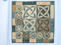
I agree about the brown, itjust does not work. I would try to find a blue that would compliment both the flowers in the print and the blue in the outer border fabric. If you don't have something in your stash, then be sure to take your project with you shopping!! Blues can be deceiving.
 10-03-2017, 03:38 AM
#27
Super Member
Join Date: Aug 2009
Location: Illinois
Posts: 1,866
There's a folded quilt peeking out behind the one in question. Do you have more/enough of the yellow that I see on that one? I'm partial to blue but it would need to be the "right" blue to look good on this quilt just as just the right brown/yellow that you've opted to change.
 10-03-2017, 10:26 AM
#29
Super Member
Join Date: Dec 2012
Posts: 1,857
I think it is because so many of the other pieces are dark (the very dark brown, the deep jewels, the bright flowers) it makes the light brown seem out of place. Perhaps a darker brown tone on tone or small print to break up the solid. But something quite a bit darker.


Thread
Thread Starter
Forum
Replies
Last Post
justwannaquilt
Links and Resources
21
02-09-2011 06:59 PM
