Go Back  Quiltingboard Forums > Main
Need HELP with coordinating fabrics with BEAUTIFUL butterfly print >

Need HELP with coordinating fabrics with BEAUTIFUL butterfly print

Need HELP with coordinating fabrics with BEAUTIFUL butterfly print

Thread Tools
 
Old 01-25-2014, 09:20 AM
  #71  
Member
 
Sitkaquilter's Avatar
 
Join Date: Mar 2009
Location: Sitka, Alaska
Posts: 60
Default

yellow with blue cross.....seems to balance the bright colors nicely.
Sitkaquilter is offline  
Old 01-25-2014, 09:36 AM
  #72  
Senior Member
 
nana20010's Avatar
 
Join Date: Sep 2009
Location: selmer tn
Posts: 457
Default

i like #1 but i also think if u switched #3 around to blue big yellow small but its urs so go for what makes u fell happy
nana20010 is offline  
Old 01-25-2014, 10:07 AM
  #73  
Super Member
 
roserips's Avatar
 
Join Date: May 2010
Location: Pe Ell, Washington
Posts: 2,512
Default

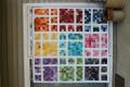
Your focus fabric is yummy I have seen and felt it. Very nice choice of quilt design and layout to keep big blocks of focus fabric to enjoy and not loose that beautiful print. I really can not decide what fabrics would look best in the EQ version since the real fabrics might look and react different together can you take pictures?
roserips is offline  
Old 01-25-2014, 11:18 AM
  #74  
Super Member
 
maryb119's Avatar
 
Join Date: Dec 2009
Location: Iowa
Posts: 8,107
Default

If yellow is too bright, it can make a "statement" in your quilt so my suggestion is to use orange or red in place of the yellow with royal blue as the second color in the "bars".
maryb119 is offline  
Old 01-25-2014, 12:16 PM
  #75  
yel
Senior Member
 
Join Date: Feb 2013
Location: 1000 miles from nowwhere
Posts: 671
Default

i like #1 as well but would like to see it with the focus/red and blue instead of the yellow
yel is offline  
Old 01-25-2014, 12:49 PM
  #76  
Super Member
 
Join Date: Feb 2011
Location: Houston, TX
Posts: 7,312
Default

I love your fabric; it is so vibrant! And the pattern you chose will really highlight it!

Of the options you presented, I would chose #1.
JanieH is offline  
Old 01-25-2014, 01:03 PM
  #77  
Power Poster
 
ube quilting's Avatar
 
Join Date: Jul 2010
Location: PA
Posts: 10,704
Default

I like the one on the left better and would try making the square where the yellow intersects blue or better yet orange. just to see what it would look like with that little pop of color.
peace
ube quilting is offline  
Old 01-25-2014, 01:05 PM
  #78  
Super Member
 
WMUTeach's Avatar
 
Join Date: Dec 2010
Location: Portage, Michigan
Posts: 7,384
Default

I think that I like #3 with a slightly softer, less bright yellow as mentioned so many times already. No matter what you choose the focus fabric is smashing!
WMUTeach is offline  
Old 01-25-2014, 01:21 PM
  #79  
Senior Member
 
wolf3349's Avatar
 
Join Date: Jan 2010
Location: SW New York
Posts: 340
Default

I like the red squares in the blue & yellow strips.
wolf3349 is offline  
Old 01-25-2014, 01:26 PM
  #80  
Senior Member
 
mrs theo's Avatar
 
Join Date: Feb 2008
Location: NEPA
Posts: 640
Default

I vote for #1, I think it will be fabulous!!!
mrs theo is offline  

Posting Rules
You may not post new threads
You may not post replies
You may not post attachments
You may not edit your posts

BB code is On
Smilies are On
[IMG] code is On
HTML code is On
Trackbacks are Off
Pingbacks are Off
Refbacks are Off


FREE Quilting Newsletter