
Working on Dogwood Blossoms, need help w colors
 03-16-2019, 04:41 PM
#1
Senior Member
Thread Starter
Join Date: Jul 2017
Posts: 809
I've started working on a quilt using the Dogwood Blossoms pattern from the Kansas City Star newspaper pattern. I found it in a book by Barbara Brackman.
I need help pairing the colors. So, I made some pairs, and you get to chose your favorites! It's a poll, yay! So chose your favorites for each number. Your answer will look like this: 1a, 2b, etc.
[ATTACH=CONFIG]610409[/ATTACH]
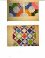
Here are the 4 blocks I have done so far. The pink one I winged before I had the pattern, and it might be a bit too small.
[ATTACH=CONFIG]610410[/ATTACH]
Thank you for your help! I appreciate it. There will probably be a few more of these, and I promise to keep posting interim pictures.
I need help pairing the colors. So, I made some pairs, and you get to chose your favorites! It's a poll, yay! So chose your favorites for each number. Your answer will look like this: 1a, 2b, etc.
[ATTACH=CONFIG]610409[/ATTACH]
Here are the 4 blocks I have done so far. The pink one I winged before I had the pattern, and it might be a bit too small.
[ATTACH=CONFIG]610410[/ATTACH]
Thank you for your help! I appreciate it. There will probably be a few more of these, and I promise to keep posting interim pictures.
 03-17-2019, 06:52 AM
#6
Super Member
Join Date: Aug 2018
Location: Greater Peoria, IL -- just moved!
Posts: 6,165
I vote for contrast as well, but I'm aware some of that is due to my vision issues, so personally I would remove 1b and 3a, but they work too. Sometimes when I have a low contrast block, I actually make the star center block and do the arranging around it rather than taking it out of the mix.
Since I typically work in scrappy projects, I typically make a couple of extra blocks each time. It's fascinating how sometimes my favorite blocks don't make it into the finished project because they didn't play well with others, while others rise and shine in a group when they were plain Janes singlely.
Since I typically work in scrappy projects, I typically make a couple of extra blocks each time. It's fascinating how sometimes my favorite blocks don't make it into the finished project because they didn't play well with others, while others rise and shine in a group when they were plain Janes singlely.

Thread
Thread Starter
Forum
Replies
Last Post
themadpatter
Links and Resources
5
12-30-2017 04:06 PM
