
Unusual Color Combos?
 03-27-2021, 06:51 PM
#11
Super Member
Join Date: Nov 2010
Location: Mars
Posts: 2,549
I've seen some *awesome* quilts in subdued color schemes right here on this board - some of them might have even been yours.

If YOU want to bring more color into your quilts, think about what you love to look at. Sunsets? Forests? Flowers? Monet? Caravaggio?
Pick three colors or three shades of one color from one of your favorites and make a quilt around that "theme," maybe?
Look at the DMC embroidery floss section at Hobby Lobby and pick three colors, there. Or the paint chip dept at Lowe's.
If you go with colors you love, you will be happy almost the whole time you're making it. (excludes unsewing, of course
 )
)There is a lovely subtlety in well-done subdued color schemes - please yourself.

 03-28-2021, 12:24 AM
#12
Super Member
Join Date: Dec 2017
Posts: 1,866
I think Jinny Beyer's approach to putting together colors is really nice. (ckcowl's Lone Star quilt is a Jinny Beyer quilt.) This video shows her approach. At 2:45 she goes through an example of creating an orange and purple quilt palette. Now, the approach that she shows gives you a large palette - about 20 different fabrics. If you want to have a smaller number of fabrics in your quilt, you can still use the approach by first creating the large palette and then selecting the appropriate number of fabrics spaced roughly evenly through the palette.
I love how Jinny Beyer's quilts break the "rules" that I was taught for *dressing* when growing up - she has orange, magenta, pink and red all right next to each other!
I love how Jinny Beyer's quilts break the "rules" that I was taught for *dressing* when growing up - she has orange, magenta, pink and red all right next to each other!
03-28-2021, 01:26 AM
#13
Super Member
Join Date: Oct 2019
Location: Corpus Christi, Texas
Posts: 2,038
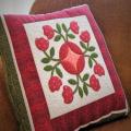
Most of my quilts are blue. Most of my fabric is blue. I'm branching out...I'm working on a teal quilt! I tried to create a colorful quilt, but the blocks were tooooo wild for me. So I turned them into tote bags and potholders. Lessons: Make what you like. Limit color choices to less than seven!
03-28-2021, 02:27 AM
#14
Super Member
Join Date: Aug 2011
Posts: 3,726
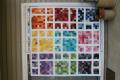
Our guild had a color challenge . Here is the link to color crayons I chose:
My Guild's Crayon Challenge
Super brights were fun to work with and got me thinking outside of my usual color comfort zone.
My Guild's Crayon Challenge
Super brights were fun to work with and got me thinking outside of my usual color comfort zone.
03-28-2021, 03:38 AM
#15
Super Member
Join Date: Dec 2010
Location: Portage, Michigan
Posts: 7,805
I am looking at all your adventurous color combos and wondering .... Why they are wild or unusual? I love them!! Haven't a bright piece of fabric to my name but I sure do like them. when quilt planning my mind just doesn't go that direction. I particularly like purple and olive green. Yum. My rule of thumb is if it occurs in nature, them it is just fine to use them together. Orange setting sun, pink clouds, concord grapes on the green vines, peach and aqua as the sun pops up over a pool of water. Up like them all.
03-28-2021, 04:45 AM
#16
Junior Member
Join Date: Mar 2015
Posts: 287
Did you ever make the quilt? Enquiring minds want to know!
Our guild had a color challenge . Here is the link to color crayons I chose:
My Guild's Crayon Challenge
Super brights were fun to work with and got me thinking outside of my usual color comfort zone.
My Guild's Crayon Challenge
Super brights were fun to work with and got me thinking outside of my usual color comfort zone.
03-28-2021, 01:37 PM
#20
Super Member
Join Date: Jan 2013
Location: Florida
Posts: 3,832
Just a few thoughts.
Back in the day of beginning quilting, pink and blue was in most quilts. After a few quilts, when purchasing fabrics, friends starting pointing out fabrics that it was my style. I decided it was an art form and I wasn't ready to be catagorized. So I chose to purchase from the sales table; all the pretties were gone and only unusual combinations were left. This earned me the reputation of unusual color combinations and forces me to use value contrast.
I think orange is an unusual color. But then it's common in fall and pastels in spring.
Now, there's 2 ways I pick color combinations. One is from a focus fabric. The other is to include spots of the opposite temperature. Examples; shades of green with a pop of orange. Green is the cool and orange is warm.
