
Opinions needed - sashing

 10-19-2024, 01:24 PM
#14
Power Poster
Join Date: Mar 2009
Location: Lake Elsinore, CA
Posts: 15,559
I'm afraid that the blocks with a light background would get lost with cream sashing. I love the idea of setting the blocks on point, but I would never cut any apart to use as setting triangles. I've never had a problem with stretching when setting blocks on point. I like the idea of using blue or the lighter brown to match the blues and browns in the blocks. And definitely use cornerstones, perhaps the darker blue if using blue sashing, darker brown or brick red if using lighter brown. Audition anything before you try it, at least with a few blocks. It's going to be a lovely quilt.
 10-20-2024, 05:48 PM
#16
Super Member
Thread Starter
Join Date: May 2013
Location: Ballwin, MO
Posts: 4,603
So I experimented today. I think my biggest problem might be that I can only shop on line, and I'm sure most of you know how the reality can differ from a website photo.
A few years ago, I bought a bunch of half yards of what you could call background solids from FQS, which they were kind enough to label for me. I checked those against my blocks tonight, from whites to the darkest -- 'Putty.' They were all too light, and (as Dunster forecast), blended into the backgrounds of my lighter blocks. The lighter shades were, (as Watson forecast), far too bright, (I'm shying away from the idea of blue; I used a pale blue once as background and it had a very chilling effect.)
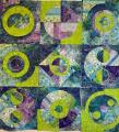
I recently bought a Kansas Troubles bundle of creams (their creams tend to be heavier). The darker of these did blend with my darker backgrounds, but one of the lighter ones seemed like a possibility. Here is block with darkest background, KT cream in between, block with lightest background (close-up to show print on cream). The quilt has four blocks with lighter backgrounds. What's your opinion on using a printed sashing rather than a solid?
A few years ago, I bought a bunch of half yards of what you could call background solids from FQS, which they were kind enough to label for me. I checked those against my blocks tonight, from whites to the darkest -- 'Putty.' They were all too light, and (as Dunster forecast), blended into the backgrounds of my lighter blocks. The lighter shades were, (as Watson forecast), far too bright, (I'm shying away from the idea of blue; I used a pale blue once as background and it had a very chilling effect.)
I recently bought a Kansas Troubles bundle of creams (their creams tend to be heavier). The darker of these did blend with my darker backgrounds, but one of the lighter ones seemed like a possibility. Here is block with darkest background, KT cream in between, block with lightest background (close-up to show print on cream). The quilt has four blocks with lighter backgrounds. What's your opinion on using a printed sashing rather than a solid?
10-21-2024, 03:13 AM
#18
Super Member
Join Date: Aug 2011
Posts: 3,863
My first thought was a creme, but that would be harder to work with all your lighter backgrounds.
I like the med blue in the first block on the left side, third row down. It is a warmer blue as you said you didn't like the cooler blues.
I like the med blue in the first block on the left side, third row down. It is a warmer blue as you said you didn't like the cooler blues.
