
is it just me...
 09-06-2011, 06:56 PM
#41
Super Member
Join Date: Aug 2010
Location: Piedmont Virginia in the Foothills of the Blue Ridge Mtns.
Posts: 8,562
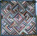
The green is a "muddy neutral." The theory is that it's muddiness is a foil for the other colors, makiing them brighter.
Mary Ellen Hopkins always used to say that "every quilt needs muddies."
Try staring at the very center of the quilt yet relaxing your eyes at the same time and see if this technique isn't valid. :D I think it's brilliant!
Jan in VA
Mary Ellen Hopkins always used to say that "every quilt needs muddies."
Try staring at the very center of the quilt yet relaxing your eyes at the same time and see if this technique isn't valid. :D I think it's brilliant!
Jan in VA
 09-06-2011, 07:03 PM
#42
Super Member

Join Date: Oct 2009
Location: Beaver PA USA
Posts: 1,656
Originally Posted by Jan in VA
The green is a "muddy neutral." The theory is that it's muddiness is a foil for the other colors, makiing them brighter.
Mary Ellen Hopkins always used to say that "every quilt needs muddies."
Try staring at the very center of the quilt yet relaxing your eyes at the same time and see if this technique isn't valid. :D I think it's brilliant!
Jan in VA
Mary Ellen Hopkins always used to say that "every quilt needs muddies."
Try staring at the very center of the quilt yet relaxing your eyes at the same time and see if this technique isn't valid. :D I think it's brilliant!
Jan in VA
09-06-2011, 07:08 PM
#43
Super Member

Join Date: Jul 2009
Location: A million dollar view!
Posts: 8,830
When I first saw this I thought it was very peaceful, unlike any pattern I had rever seen, and it was 'edgy' with the argyle pattern on the border.
I read all the comments and then I read Jan in VA's idea, so I did it. Within moments, it looked as if the center was moving to the back of the quilt or moving away from me and getting smaller. Next thing I knew, my eyes were so relaxed I was looking at the inside of my lids and nodding.
The hues of each color were matched up pretty good IMHO. I still think it is lovely and I don't care for avacado green. I remember appliances, a car, and carpet that color, too.
09-06-2011, 07:42 PM
#44
Super Member
Join Date: Sep 2010
Location: North AL
Posts: 1,830
Originally Posted by mom-6
The quilt is gorgeous, but I personally would prefer a different shade of green, maybe lighter or else more of a true green or even a teal. But those are my favorite greens so I might be a bit prejudiced!
I agree.
09-06-2011, 07:44 PM
#45
Power Poster
Join Date: Oct 2009
Location: Idaho
Posts: 11,375
Originally Posted by Jan in VA
The green is a "muddy neutral." The theory is that it's muddiness is a foil for the other colors, makiing them brighter.
Mary Ellen Hopkins always used to say that "every quilt needs muddies."
Try staring at the very center of the quilt yet relaxing your eyes at the same time and see if this technique isn't valid. :D I think it's brilliant!
Jan in VA
Mary Ellen Hopkins always used to say that "every quilt needs muddies."
Try staring at the very center of the quilt yet relaxing your eyes at the same time and see if this technique isn't valid. :D I think it's brilliant!
Jan in VA

 09-07-2011, 04:32 AM
#48
Super Member
Thread Starter
Join Date: Jun 2010
Location: Vermont
Posts: 7,142
Originally Posted by Jan in VA
The green is a "muddy neutral." The theory is that it's muddiness is a foil for the other colors, makiing them brighter.
Mary Ellen Hopkins always used to say that "every quilt needs muddies."
Mary Ellen Hopkins always used to say that "every quilt needs muddies."
Oh-oh, sounds like the quilt police !! I don't think I have any muddies in any of my quilts, guess I will be going to the Big House for a long time!
09-07-2011, 04:33 AM
#49
Super Member
Join Date: Jul 2010
Location: Glenmoore, PA
Posts: 7,941
Originally Posted by ptquilts
or would you prefer this quilt kit in different colors
[img]http://www.keepsakequilting.com/imag...px?IMAGE=https://www.kqimageserver.com/kqimages/parts/5313.JPG&NAME=%20%20%20%20%20KALEIDOSCOPE%20BLOCK%20OF%20TH E%20MONTH%20COMPLETE%20KIT[/img]
I don't know, olive green and purple? I would love to see it in shades of blue. I don't know anyone whose bedroom is done in shades of olive green and purple.
I was looking through the new Keepsake catalog and noticed a lot of quilt kits, etc in colors that make me go bleh....
Am I being oldfashioned? Are these the new modern colors? I'm not even going to mention the price...


Thread
Thread Starter
Forum
Replies
Last Post
dreamer2009
General Chit-Chat (non-quilting talk)
55
03-11-2011 10:00 PM
PurpleBecca
Pictures
52
05-05-2010 12:35 PM
