
Need help with fabric choices
 12-21-2011, 06:41 AM
#21
Member
Join Date: Dec 2011
Posts: 6
I like to have light—medium—and dark fabrics in a collection. Pictures don't always tell the story—the shades seem to have a medium cast. As "QM" recommended, a lighter shade and deeper indigo will make your beautiful prints "pop."
(I've made way too many quilts will all mediums!)
(I've made way too many quilts will all mediums!)
 12-21-2011, 07:50 AM
#22
Super Member
Join Date: Oct 2010
Location: howell, Mi
Posts: 2,345
I agree with every one else. The green doesn't go. The blues you have picked are beautiful, but are all medium. You need to "shake" it up a little. Maybe some very dark blues or some very light. Let us see what you come up with and save the green for another project.
Sue
Sue
12-21-2011, 07:57 AM
#23
Senior Member

Join Date: Jul 2010
Location: Cheshire, Massachusetts
Posts: 838
I disagree with the ladies above. Maybe it would help to see the pattern you propose to use, but I can almost envision looking out across a beach through green hanging palm leaves towards waves of ocean blue.
12-21-2011, 08:03 AM
#24
Junior Member

Join Date: Nov 2011
Location: Oregon
Posts: 204
I love the materials but... you asked for opinions. The blues are nearly all the same tone/shade. Need some darker and some lighter to give depth or dimension or contrast depending on your pattern. Another color usually works in a pattern to add a note of surprise but not this green. Another darker green or go with contrast and use a golden yellow which will look beautiful against this blue. Have fun playing with other fabric colors.
Please let us know what you decide on and we would love to see the quilt when finished. Happy quilting.
Please let us know what you decide on and we would love to see the quilt when finished. Happy quilting.
12-21-2011, 02:50 PM
#25
Super Member
Thread Starter
Join Date: Nov 2010
Location: Morganton, North Carolina
Posts: 2,882
Originally Posted by Cheshirecatquilter

I disagree with the ladies above. Maybe it would help to see the pattern you propose to use, but I can almost envision looking out across a beach through green hanging palm leaves towards waves of ocean blue.
Still auditioning assorted fabrics for the quilt. Thanks for all the in-put
 12-21-2011, 03:38 PM
#26
Super Member
Join Date: Apr 2011
Location: Bosque County, Texas
Posts: 2,709
Did you see the picture of the Dresden Plate with the black in it? It was the most beautiful Dresden many of us have ever seen - and it was because of the black that sparked the whole thing. Try a black print with your blues. Ditch the idea of any green.
12-21-2011, 04:09 PM
#27
Super Member

Join Date: Aug 2010
Location: S. W. Indiana
Posts: 7,484
Originally Posted by wuv2quilt
These are the fabrics for my Quilts for Quilters Swap: I'd like to get some in-put as to my choices so far.
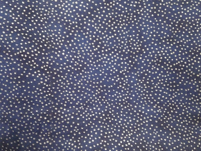
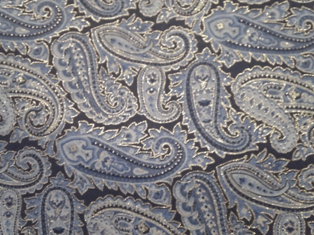
I'm still picking out fabrics for islandwiz1's quilt. Hope to post some pics of the fabrics to get feedback on my choices. I'm worried that the quilt may read a little "VANILLA". The fabrics are gorgeous, and in assorted blues with a "touch of sparkle", I also have a green for leaves to place here and there. Please give me your thought and ideas....I will NOT be offended....just want a little in-put OK, here are my fabrics....so far.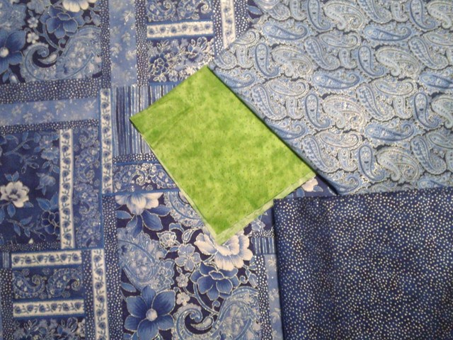
All the fabs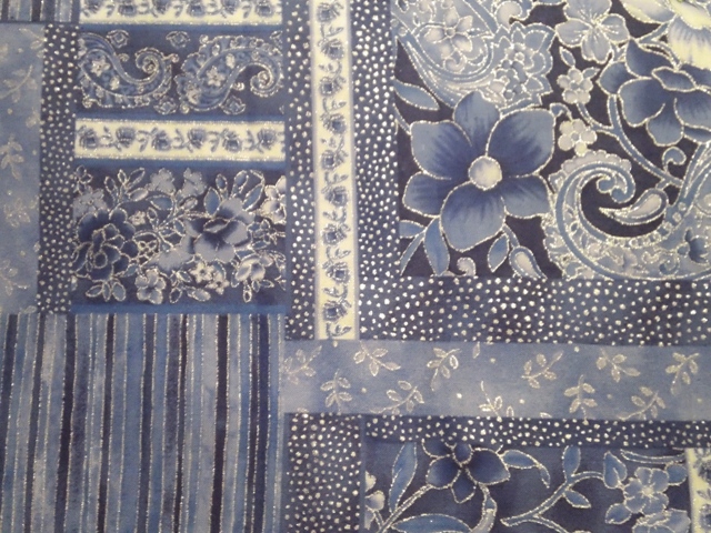
Fabric 1
Fabric 2
Fabric 3
OK, here are my fabrics....so far.All the fabs
Fabric 1
Fabric 2
Fabric 3
12-21-2011, 04:37 PM
#28
Super Member

Join Date: Jun 2010
Location: The Evergreen State
Posts: 1,558
The blues are beautiful but best I can tell from the photo are similar in value. You might add a solid or tone-on-tone pale pale blue and a dark/dark (use the floral to reference the light/dark).
12-21-2011, 10:07 PM
#29
Senior Member
Join Date: Apr 2010
Location: Lived in San Diego now retired in Eagar, AZ.
Posts: 887
i'm sorry, i'm really trying to influence you but not to what i like....what i think you saw when you chose your samples.... that green .... is the lifeblood of that group.... it is what makes all the blues so vibrant....with a light and a dark you are gonna love it... and i think your idea of to do something 'smashing' with it is just right...an occasional 'shadow' under one or two blades in the plate, or a tiny appliqued leaf or flower in the corner or the block or on the plate...or a tiny zinger flange border between all your blocks and their border... and if you don't like the neutral for the background of the plates, how about using the dark blue on blue for the backgrounds? all your mediums will then be 'lights' unless you add a little white here and there... remember, value is all relative...
Last edited by deemail; 12-21-2011 at 10:09 PM.


Thread
Thread Starter
Forum
Replies
Last Post
