Go Back  Quiltingboard Forums > Main
Time to select borders... >

Time to select borders...

Time to select borders...

Thread Tools
 
Old 01-13-2016, 05:38 AM
  #51  
Super Member
 
Join Date: May 2012
Location: Central Wisconsin
Posts: 4,391
Default

I think it needs the "stop border" as in #2, but I would make one of the narrow borders about half the size or less of what you have there. A tiny line separating the other two adds interest.
maviskw is offline  
Old 01-13-2016, 05:45 AM
  #52  
Super Member
 
WMUTeach's Avatar
 
Join Date: Dec 2010
Location: Portage, Michigan
Posts: 7,400
Default

I like #1 but really either is just fine. The second seems a bit more "dark" while #1 is lighter.
WMUTeach is online now  
Old 01-13-2016, 06:18 AM
  #53  
Member
 
Join Date: Sep 2015
Posts: 11
Default

Beautiful. #2 has more dimension
crispins is offline  
Old 01-13-2016, 08:31 AM
  #54  
Senior Member
 
Join Date: Feb 2014
Location: Southern California
Posts: 341
Default

Both would be beautiful, but I'm casting my vote for #2.
gram2five is offline  
Old 01-13-2016, 09:24 AM
  #55  
Power Poster
 
Join Date: Feb 2011
Location: Lowell, MA
Posts: 14,083
Default

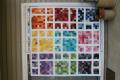
Great fabric choices, love the dark blue with purple and black, very nice. I think I like #2 with the narrow inner border of the outside border fabric with the lighter blue in between. It seems to make the blocks "float" that way and make them stand out.
MargeD is offline  
Old 01-13-2016, 09:30 AM
  #56  
Power Poster
 
Join Date: Jan 2011
Location: Southern USA
Posts: 15,963
Default

Just my opinion but I would leave out the two narrow borders, just use the wide border. This way the quilt pattern will float.
Onebyone is offline  
Old 01-13-2016, 09:37 AM
  #57  
Member
 
Join Date: Nov 2013
Posts: 57
Default

2, thanks for asking
donnalbaldwin is offline  
Old 01-13-2016, 09:42 AM
  #58  
Super Member
 
Join Date: Sep 2012
Location: Homosassa, FL
Posts: 2,267
Default

#2, the dark inner border makes the pattern stand out more, but both are great, and LOVE the material.
Carol34446 is offline  
Old 01-13-2016, 09:55 AM
  #59  
IQ2
Senior Member
 
Join Date: Nov 2011
Location: NY
Posts: 301
Default

Originally Posted by feline fanatic View Post
I like number #1 better. To my eye the blocks of focus fabric (the galaxy fabric) that abut the border disappear in choice #2 but they are more vibrant and come to the forefront in #1. #2 also seems to darken the overall appearance of the quilt but that could simply be monitor perception.
This is my exact opinion also.
IQ2 is offline  
Old 01-13-2016, 10:13 AM
  #60  
Super Member
 
Join Date: Dec 2012
Posts: 1,857
Default

they are both great. I often ask students 'which one do you keep being drawn back to?' One has a very definite edge and the other has a floating look. Both are beautiful in a different way. Trust yourself - too often we second guess ourselves out of the one we prefer. The only thing I would do for sure is to keep the pictures of both. In the future you may want to do the other one.
klswift is offline  
Related Topics
Thread
Thread Starter
Forum
Replies
Last Post
miholmes
Main
11
05-06-2011 06:51 PM
Deb watkins
Member Swaps and Round/Row Robins
290
12-27-2010 09:36 PM
kso
Main
7
12-22-2010 10:15 AM
Bubblegum0077
Main
13
08-30-2010 02:32 PM

Posting Rules
You may not post new threads
You may not post replies
You may not post attachments
You may not edit your posts

BB code is On
Smilies are On
[IMG] code is On
HTML code is On
Trackbacks are Off
Pingbacks are Off
Refbacks are Off


FREE Quilting Newsletter