Go Back  Quiltingboard Forums >
  • Main
  • Which one do you like better? >
  • Which one do you like better?

  • Which one do you like better?

    Thread Tools
     
    Old 02-13-2017, 05:30 AM
      #11  
    Super Member
     
    Join Date: Aug 2013
    Posts: 9,299
    Default

    The first one, because I'm more drawn to brights. But the second is quite soothing with its low contrast.
    zozee is offline  
    Old 02-13-2017, 05:40 AM
      #12  
    Super Member
     
    Watson's Avatar
     
    Join Date: Dec 2015
    Location: Ontario, Canada
    Posts: 4,357
    Default

    First one.

    Watson
    Watson is offline  
    Old 02-13-2017, 05:56 AM
      #13  
    Super Member
     
    Macybaby's Avatar
     
    Join Date: Jul 2013
    Location: South Dakota
    Posts: 8,145
    Default

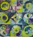
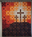
    I like the second one. I'm one of those that does not like a lot of contrast, and really do not like a "pop" of color that designers are always saying you need. To me it often looks like something out of place LOL!!

    The good part, I've yet to meet a quilt that someone didn't fall in love with, so they are ALL good
    Macybaby is offline  
    Old 02-13-2017, 05:59 AM
      #14  
    Power Poster
     
    Join Date: Mar 2013
    Location: Corpus Christi, Tx.
    Posts: 16,105
    Default

    I like the bolder/brighter one but depends on the customer.
    tessagin is offline  
    Old 02-13-2017, 05:59 AM
      #15  
    Power Poster
     
    Join Date: Jul 2010
    Location: McLoud, OK
    Posts: 13,264
    Default

    No preference...like both.
    Homespun is offline  
    Old 02-13-2017, 07:36 AM
      #16  
    Senior Member
     
    Diannia's Avatar
     
    Join Date: Mar 2010
    Location: Fresno, CA
    Posts: 917
    Default

    I like them both and at first leaned towards the 1st one but on 2nd look decided that since you will be adding applique I would have also chosen the 2nd one because it's muted and won't distract from the bolder flowers and butterflies. Can't wait to see the finished project...please share!
    Diannia is offline  
    Old 02-13-2017, 08:13 AM
      #17  
    Super Member
     
    Join Date: Nov 2011
    Location: Tn
    Posts: 8,806
    Default

    I think it would depend on the appliqué pieces
    cjsews is offline  
    Old 02-13-2017, 09:18 AM
      #18  
    Super Member
     
    Join Date: Mar 2011
    Location: Peotone IL
    Posts: 2,802
    Default

    The second one. The appliques will show up better on these muted colors.
    gramajo is offline  
    Old 02-13-2017, 09:48 AM
      #19  
    Super Member
     
    Join Date: Jul 2010
    Location: Flagstaff, Arizona
    Posts: 9,475
    Default

    I like the first one best but both are pretty.
    Jordan is offline  
    Old 02-13-2017, 03:28 PM
      #20  
    Super Member
     
    Join Date: Dec 2009
    Location: Duncan, SC, 29334 USA
    Posts: 4,580
    Default

    ***
    *** One
    ***
    jbj137 is offline  
    Related Topics
    Thread
    Thread Starter
    Forum
    Replies
    Last Post
    Favorite Fabrics
    Main
    56
    03-04-2012 05:00 PM
    LeslieFrost
    Pictures
    34
    02-29-2012 08:00 PM
    hperttula123
    Pictures
    144
    05-17-2011 09:09 PM
    barbgooch
    Pictures
    95
    06-25-2010 05:42 PM
    ohmisslizzie
    Main
    54
    01-29-2010 08:40 AM

    Posting Rules
    You may not post new threads
    You may not post replies
    You may not post attachments
    You may not edit your posts

    BB code is On
    Smilies are On
    [IMG] code is On
    HTML code is On
    Trackbacks are Off
    Pingbacks are Off
    Refbacks are Off


    FREE Quilting Newsletter