
Bonnie Hunter Mystery Quilt 2017 - En Provence
 12-23-2016, 04:33 PM
#1001
Super Member
Join Date: Oct 2013
Location: Tulsa, Ok
Posts: 4,582
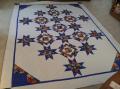
Good job everyone! I am caught up too---just finished clues 4 and 5 (but only half)! Going to be gone for a few days, so it feels good to have them done! Happy holidays to all!!
[ATTACH=CONFIG]564311[/ATTACH]
[ATTACH=CONFIG]564311[/ATTACH]
 12-23-2016, 05:55 PM
#1002
Super Member

Join Date: Aug 2013
Location: Sunny Florida, USA
Posts: 1,051
There are a lot of beautiful blocks showing up here. I'm glad that this week's clue was easy and fast. Here are my blocks for Clue 4 and 5. Merry Christmas everyone.
[ATTACH=CONFIG]564316[/ATTACH]
[ATTACH=CONFIG]564317[/ATTACH]
[ATTACH=CONFIG]564316[/ATTACH]
[ATTACH=CONFIG]564317[/ATTACH]
 12-23-2016, 10:52 PM
#1004
Super Member
Join Date: Aug 2007
Location: South Puget Sound, Wa. State
Posts: 2,462
Tweety,
Can you give me the measurements for the strips and the cutting for these HST as I don't have Bonnies ruler? I am, or seem to be, perplexed on making these...
Thanks
Kirsten
Can you give me the measurements for the strips and the cutting for these HST as I don't have Bonnies ruler? I am, or seem to be, perplexed on making these...
Thanks
Kirsten
12-24-2016, 07:59 AM
#1006
Senior Member

Join Date: Jun 2011
Location: Ontario, Canada
Posts: 305
Between school, work and a constant stream of colds I had only completed clue #1. But last night I was feeling a bit better and so I completed clue # 3 and #5. I am not completely caught up but it feels good to catch up at least that much. Problem is, I am now reconsidering my constant (again) and my teal and blue (Bonnie's yellow and green)
Do these fabrics still work with my blocks? I feel like the blue has too much white in it and I don't like the teal at all - it's more teal than the photo shows.
Now I am thinking 2 possibilities: A) light, light-medium, and medium purple (the constant), light and light-medium blue + neutral
or B) light, light-medium purple, light, light-medium blue and a light pink for the constant.
Any input would be appreciated! I am going to try to think about it and buy the new fabric on Monday, but the impulsive part of me wants to go out NOW to shop lol
12-24-2016, 08:11 AM
#1007
Power Poster
Join Date: Jun 2010
Location: New York
Posts: 17,564
[ATTACH=CONFIG]564322[/ATTACH]
Picture below is the HST finger pressed that is 3 1/2". It was so easy to chain piece.
[ATTACH=CONFIG]564323[/ATTACH]
Last edited by Tweety2911; 12-24-2016 at 08:20 AM.
12-24-2016, 08:42 AM
#1008
Super Member
Join Date: May 2013
Location: Ballwin, MO
Posts: 4,256
lizzie3, are you purposely avoiding darks in your choices? In Bonnie's photos in the introduction, I read her purple and green as darks, her constant and yellows as mediums, her lavender as a medium light, and light neutrals. I would try to stick with those value relationships if you want to duplicate the effect of her pattern.
The other thing is, that judging by what we've seen so far with people's units, you will want the constant to be a different hue than the other colors. I would not make the constant purple if purple is one of your other colors, but would choose something that really pops with the other colors. I see the constant as a highlight color, meaning it is used sparingly but really stands out. So I think the second option you listed, with the pink constant, sounds better than the first.
As far as the photo, I don't think the blue has too much white to use as Bonnie's green, because the background is quite dark.
Beautiful units, JeanneS and AlvaStitcher!
Last edited by joe'smom; 12-24-2016 at 08:44 AM.


Thread
Thread Starter
Forum
Replies
Last Post
NZquilter
QuiltingBoard Challenges & Contests
2782
10-31-2018 02:51 PM
wordpaintervs
Links and Resources
1
12-04-2013 11:55 PM
