
More photos re: sashing, cornerstones, borders
 03-03-2014, 08:16 AM
#1
Super Member
Thread Starter
Join Date: Apr 2012
Location: Texas
Posts: 2,369
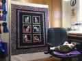
Forgive me for bringing this back to the board, but my request for suggestions and your thoughtful comments have resulted in a kind of epiphany for me. The photos below demonstrate what I've realized. The white on white sashing, though a pretty severe contrast, draws attention to the blocks and makes them "pop"--stand out. The print sashing, which someone suggested, lets the blocks disappear, so that the eye goes to the center: the pinwheels and 4 patches, and/or sees the quilt as a whole. Because I'm old school and like "matchy matchy" as designers now call it, I respond to the more traditional, formal, print sashing. It unifies the quilt, blends it, puts the emphasis on the entire quilt instead of the individual blocks. I like it....and I also think it is a little boring.
Until I studied photos of these layouts I hadn't ever fully realized what sashing--as well as borders, etc.--can and sometimes does, do to completely change a quilt's total image. A long time sewer, I'm a fairly new quilter and I'm still fascinated by the visuals, the illusions, of quilts -- the primary and secondary patterns that are created by the blocks and the arrangement of blocks and surrounding fabric -- and I'm still learning about it. Sometimes you--or I, at least-- cannot see these with the eye, but the camera sees it. (I discovered that when making my chicken attic window quilt; I couldn't see and appreciate the illusion until I took photos of it. ) Also, sometimes we (as the creators) are just too close to the project and can no longer see either the pieces or the whole.
Anyway, still not sure how I will finish this quilt. Will I go safe and comfortable with the print sashing or modern and a little daring with the WOW? Will I use the orange as a very narrow flange? Haven't decided. But I wanted to share what your suggestions and comments have helped me realize!
[ATTACH=CONFIG]465487[/ATTACH][ATTACH=CONFIG]465492[/ATTACH]
 03-03-2014, 08:22 AM
#3
Super Member
Join Date: Dec 2009
Location: Sacramento, CA
Posts: 2,033
I love these blocks. It will be interesting to see your final choices. I'm sure it will be great no matter which way you go. I prefer the white, but it is not my quilt. It is one of the things I love about quilting: Different people can make the same pattern so different with just small design choices that make big impacts.

 03-03-2014, 09:15 AM
#7
Super Member

Join Date: Nov 2013
Location: Green Valley AZ
Posts: 2,574
Exactly how I feel, the print is very pretty and not a wrong choice because it does exactly as you described and emphasize the whole quilt not the blocks. Either way I would love to see the narrow orange flange incorporated.
03-03-2014, 09:22 AM
#8
Super Member

Join Date: Feb 2009
Location: South central Nebraska, US
Posts: 5,367


Thread
Thread Starter
Forum
Replies
Last Post
Prism99
Tutorials
39
03-28-2014 09:25 PM
Ruby the Quilter
Main
11
09-04-2011 04:59 PM
