Log Cabin Center 'hearth' square

 01-24-2023, 03:37 AM
#12
Super Member
Join Date: Aug 2009
Location: Illinois
Posts: 1,809
The hearth is "supposed to be" warm as was the hearth in a log cabin so red has been traditional. Since you are using browns and cream, I believe I would use a darker red that has a hint of brown in the dye. I suggest you put several test groups together and leave them on the guest bed for a day or two to walk by. See which one pleases you most. It may be that your browns tend to the red or to the gold and that may let you know which hearth is most pleasing.
Nix the black--the fire in the hearth went out! Need a bit of a spark.
Nix the black--the fire in the hearth went out! Need a bit of a spark.
01-24-2023, 03:49 AM
#13
Super Member
Join Date: Dec 2010
Location: Portage, Michigan
Posts: 7,503
I would go with the deeper red also. If you have enough options and like the scrappy look, use different red fabrics for the red hearth. On the other hand, that center square is usually so small having it consistent through out the quilt can sooth the multiple colors you are using in your logs. In my opinion, black, yellow or orange would pop and you would lose the soft warmth of the hearth. In the end, it is all about what you want to achieve and what pleases your eye.
01-24-2023, 04:33 AM
#14
Senior Member
Thread Starter
Join Date: May 2022
Location: Northeast
Posts: 682
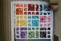
This may help in choices. This is the fabric I'm thinking about and also the colors of Browns and Creams (jelly rolls) I'll be using. I leaning toward either the gold on the right in the first picture and the red on the right in the second picture. But open to suggestions.
Last edited by quiltsfor; 01-24-2023 at 04:36 AM.
01-24-2023, 04:37 AM
#16
Senior Member
Thread Starter
Join Date: May 2022
Location: Northeast
Posts: 682
01-24-2023, 04:40 AM
#17
Senior Member
Thread Starter
Join Date: May 2022
Location: Northeast
Posts: 682
Now I'm thinking of the gold (mustard color) on the left in the first picture (posted above) or the red on the right in the second picture. I'm leaning more toward the gold then the red. But, I keep flipping on which gold. I don't want to mix as I want the center 'hearth' square to be the same fabric throughout. But, some of the browns/gold almost is the same color as the golds I have. So, now I'm leaning more to the red on the right of the second picture. The reds in the third picture, I'm kind of 'nah'. But, looking at the fabric again, I kind of like the gold, but would it blend in too much?
Last edited by quiltsfor; 01-24-2023 at 04:46 AM.
01-24-2023, 07:57 AM
#19
Super Member
Join Date: Aug 2010
Location: Roswell, NM
Posts: 1,727
I originally suggested golden yellow but looking at your browns I think your red in the second picture is the best choice. The red gives the contrast you want against the other colors. Looking forward to seeing your finished quilt.