Go Back  Quiltingboard Forums > Main
not sure how to lay this out. >

not sure how to lay this out.

not sure how to lay this out.

Thread Tools
 
Old 01-08-2012, 09:00 PM
  #11  
Super Member
 
EasyPeezy's Avatar
 
Join Date: Mar 2010
Location: Canada
Posts: 3,456
Default

I'm with Dunster. I would try to mix it up and see how it looks.
EasyPeezy is offline  
Old 01-09-2012, 06:24 AM
  #12  
Power Poster
 
QuiltnNan's Avatar
 
Join Date: Mar 2011
Location: western NY formerly MN, FL, NC, SC
Posts: 51,433
Default

Originally Posted by dunster View Post
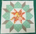
This may sound wacky, but have you tried mixing up all the blocks (and by that I mean don't put 4 light ones together, and 4 dark ones together like you have - mix it up)? I think the problem you are seeing is that there's such a dramatic difference between the two, and if they're all mixed up it might look great.
this was my first thought as well
QuiltnNan is offline  
Old 01-09-2012, 06:31 AM
  #13  
Super Member
 
quiltymom's Avatar
 
Join Date: Aug 2010
Location: Springfield, Mich(Battle Creek)
Posts: 3,208
Default

Originally Posted by Mad Mimm View Post
I like that suggestion.
I agree!!!
quiltymom is offline  
Old 01-09-2012, 06:35 AM
  #14  
Senior Member
 
pinkberrykay's Avatar
 
Join Date: Nov 2011
Location: SOO, MI
Posts: 838
Default

Defiantly mix them up, I love the fabric!!
pinkberrykay is offline  
Old 01-09-2012, 06:39 AM
  #15  
Super Member
 
Join Date: Jul 2010
Location: Ohio
Posts: 2,148
Default

Did you try using sashing and mixing up the blocks??
bigsister63 is offline  
Old 01-09-2012, 07:16 PM
  #16  
Super Member
 
Join Date: May 2009
Posts: 1,265
Default

Originally Posted by deemail View Post
personally, i would not attempt to layout anything this scrappy with the matching blocks right together...move them around, take pix... the pictures take you further away and you can judge better... they would be great as stated by dunster...or putting in a unifying sash that would let them all relate to the same thing ... can's state for sure because of computer color differences, but a med dark gray would make them ALL get lighter and brighter by comparison... you would benefit by just a little more contrast.... but as i said, that may be my computer flattening them a bit...the deep coral is the brightest color on my screen... if you have something in gray...lay them on it but put a few inches apart to simulate the sashing... maybe they all just need a frame... it is really interesting and i'm sure you will trust your eye when you see the one that's right...
This is what I'd recommend as well - both layouts you've shown read as "stark" - mixing up the blocks (taking photos each time so you can decide and recreate the one you decide on - ask me why I strongly recommend this...!) - would provide some nice movement for your eye and actually blend the blocks better.
Wunder-Mar is offline  
Old 01-09-2012, 08:47 PM
  #17  
Junior Member
 
Christine George's Avatar
 
Join Date: Oct 2011
Location: Milwaukee WI
Posts: 178
Default

I'm with you dunster, mix them up. And since they're so similar maybe some sashing between?
Christine George is offline  
Related Topics
Thread
Thread Starter
Forum
Replies
Last Post
deedum
For Vintage & Antique Machine Enthusiasts
27
02-04-2012 06:28 PM
deedles215
Main
16
07-05-2010 05:01 AM
barnbum
Pictures
48
04-30-2010 09:23 AM
barnbum
Pictures
29
01-23-2009 06:04 PM
barnbum
Pictures
40
08-30-2008 03:43 PM

Posting Rules
You may not post new threads
You may not post replies
You may not post attachments
You may not edit your posts

BB code is On
Smilies are On
[IMG] code is On
HTML code is On
Trackbacks are Off
Pingbacks are Off
Refbacks are Off


FREE Quilting Newsletter