
Bonnie Hunter Mystery Quilt 2017 - En Provence
 03-25-2017, 09:43 AM
#1831
Super Member

Join Date: Sep 2014
Location: Rural Oklahoma
Posts: 5,374
Your purple 4 patches are also going in different directions. Your yellow / gold squares are so much darker then your 4 patch yellows, that might be what you find "uncomfortable" about the colors. Have you tried the reverse side of the yellow squares? (back side of the fabric)
 03-25-2017, 10:44 AM
#1832
Super Member
Join Date: May 2013
Location: Ballwin, MO
Posts: 4,211
Marcia, I think it's looking fine now. Keep in mind that this pattern really must be seen from a distance to be appreciated. When you're close to it, it is going to look super busy no matter what fabrics you have. I would keep going, and as Kassaundra said, watch the placement of those purple/lavender 4-patches.
03-25-2017, 03:15 PM
#1833
Super Member

Join Date: Oct 2012
Location: West Central Texas
Posts: 2,586
Substituting the burgundy for the red really made all the difference. As others have said, Bonnie's quilts never look good when viewed a block at a time and up close. Try putting four blocks up on the design wall and view from about 10 feet away. I think you'll love your colour choices.
03-25-2017, 07:11 PM
#1835
Super Member
Join Date: Aug 2010
Location: Camarillo, CA
Posts: 4,598
Battle Axe - I also had a problem with the yellow squares being to dark/bright in my quilt and I tried to match them to Bonnie's swatches. I auditioned some other yellows I had in my stash and chose a much softer shade. It made a world of difference. You may just have to try another yellow???
 03-26-2017, 07:29 AM
#1836
Super Member
Join Date: Apr 2010
Location: Northeastern Indiana
Posts: 2,800
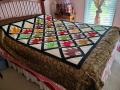
Here is an update. And I SOOOO appreciate all the help. I do feel helpless when it comes to color. I can look at a quilt and appreciate the beauty, but I guess I don't know what makes it work.
My computer does not recognize the new picture as different. Let me try some other stuff.
My computer does not recognize the new picture as different. Let me try some other stuff.
03-26-2017, 07:56 AM
#1837
Super Member
Join Date: Oct 2012
Location: West Central Texas
Posts: 2,586
Well, I probably am going to be a dissenting voice and say I like the strong yellow. Since you don't have many pastels in the quilt, I think it goes together very well. Then again, this is coming from someone who switched out a pale yellow for a medium in mine.
03-28-2017, 03:45 AM
#1839
Super Member
Join Date: Apr 2010
Location: Northeastern Indiana
Posts: 2,800
Again, I want to thank everyone on the board who has offered suggestions. They are all good ideas. I am still somewhat disappointed in my rendition. It just doesn't have the punch that some of your other ones do.
My Dad was red/green color blind. I am a carrier but have no living children. But the emotional stress of living in a house where Dad did not know any colors, I think has left me scarred. He would buy a new truck and bring it home telling us that it was just so beautiful, couldn't wait for the sun to come up so we could see it. It was Mouse Grey. He said that was the only color that did not hurt his eyes.
Amazon had Bonnie Hunter's Addicted to Scraps book on sale this a.m.
Last edited by Battle Axe; 03-28-2017 at 03:54 AM. Reason: more info
03-28-2017, 05:13 AM
#1840
Super Member

Join Date: Oct 2011
Location: Ottawa, Ontario, Canada
Posts: 1,111
I have a suggestion for you, that might help future quilts. However, keep in mind that I don't do scrappy - my en Provence was made with a single fabric for each colour.
I notice that you, for example, used the same purple for all of the purple tri-recs sections. And the same 4 (different from the first) for all the 4-patches. I think if you are going to go as scrappy as you did, you need to really go for it - and use every colour equally in every step. Your result draws my eye towards the purple points, I think at the expense of the overall purple flow that Bonnie achieved.
I wouldn't change anything in this quilt now (not even the yellow, personally), and think when the whole thing is together and you can view the overall you may like it more. But I thought I'd point that out as some food for thought for future projects.

Thread
Thread Starter
Forum
Replies
Last Post
NZquilter
QuiltingBoard Challenges & Contests
2782
10-31-2018 02:51 PM
wordpaintervs
Links and Resources
1
12-04-2013 11:55 PM
